responsive navbar (6)
Welcome to our responsive navbar category. Here, you'll find a comprehensive collection of stylish and functional responsive navbar components designed to enhance user experience and streamline navigation on your website. Each component is meticulously crafted to be responsive, customizable, and easy to integrate into any project, ensuring you have the tools you need to create an engaging online presence.
Our responsive navbar components offer a seamless blend of form and function. Designed with modern web standards in mind, these components not only look great but also perform exceptionally well across all devices. Whether you're building a personal blog, a corporate website, or an e-commerce platform, our responsive navbar solutions will help you deliver a polished and professional user experience.
Features
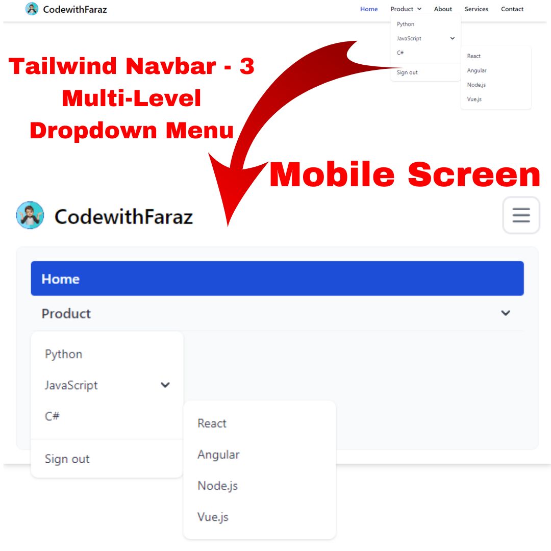
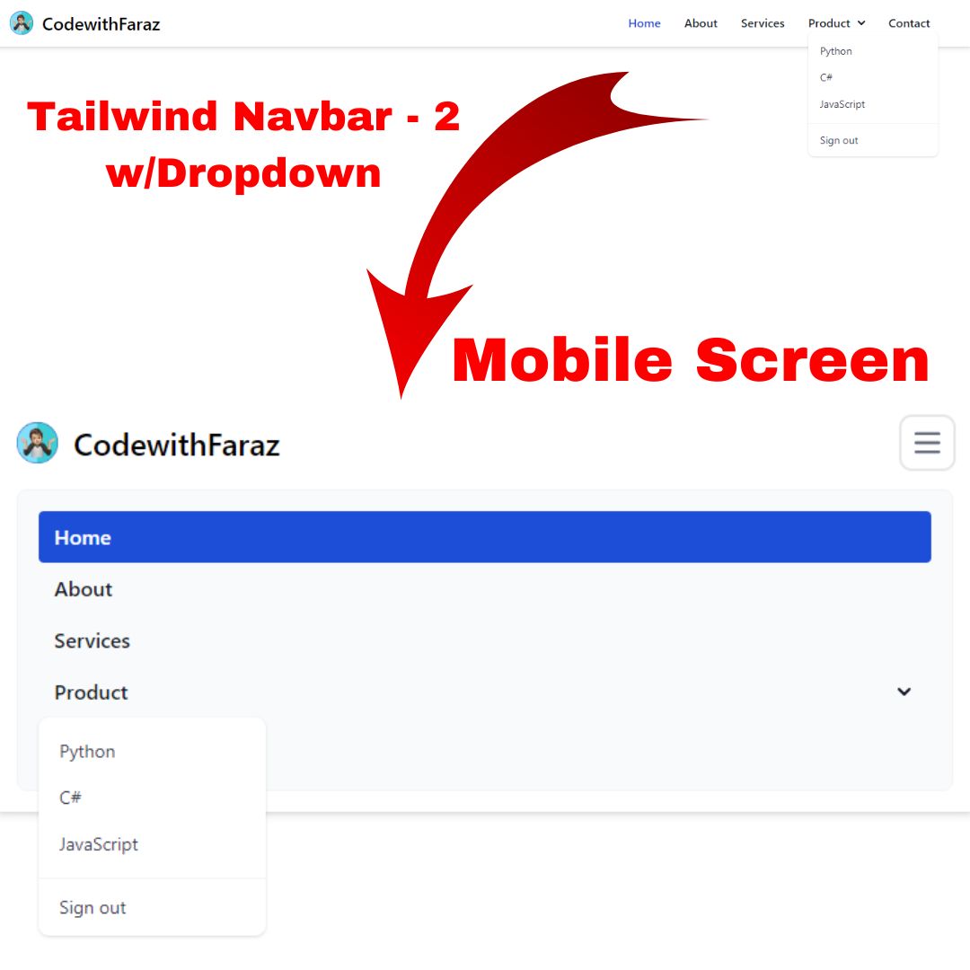
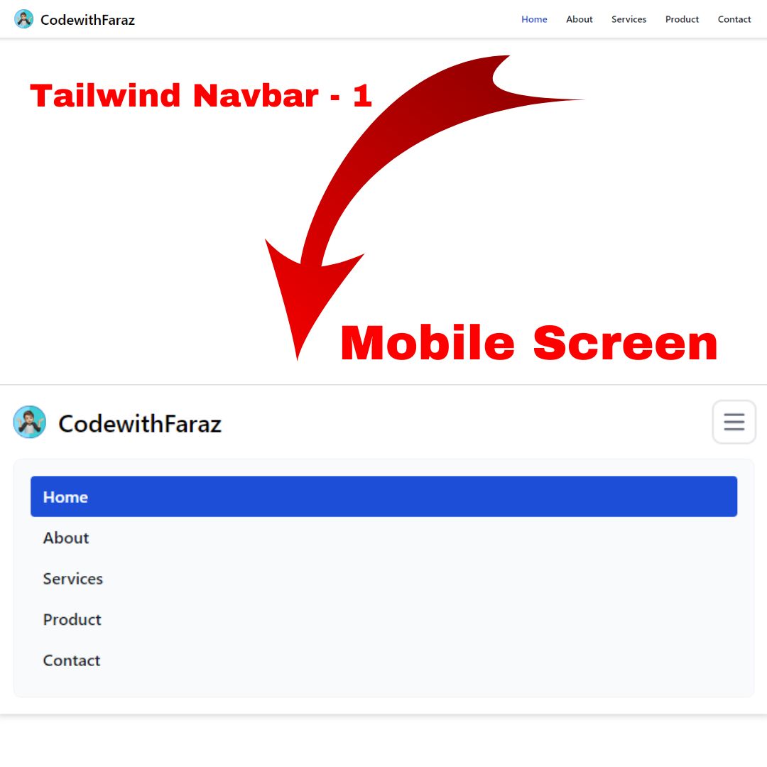
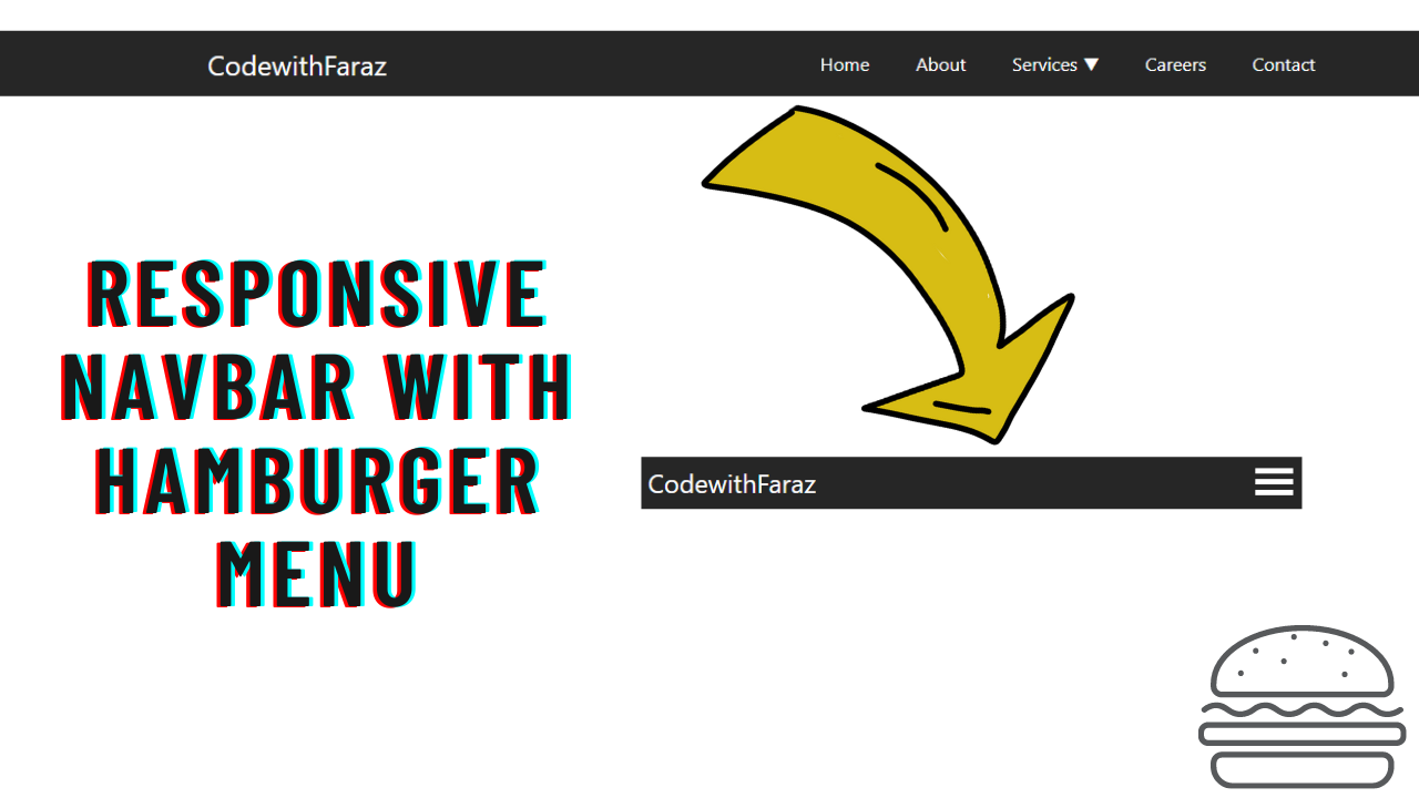
- Responsive Design: Our responsive navbar components are fully responsive, adapting gracefully to different screen sizes. This ensures a smooth and consistent user experience on desktops, tablets, and mobile devices.
- Customization Options: Tailor the appearance and behavior of your responsive navbar components to match your site's aesthetic. Change colors, fonts, and layouts effortlessly using our well-documented customization settings.
- Interactive Elements: Enhance user interaction with features like dropdown menus, search bars, and toggle buttons. These interactive elements are designed to provide a richer and more intuitive navigation experience.
- Accessibility: Accessibility is a top priority in our responsive navbar designs. Each component is built to be easily navigable by all users, including those with disabilities, ensuring compliance with web accessibility standards.
How to Use
- Integrating our responsive navbar components into your project is straightforward. Simply follow the provided documentation, which includes step-by-step instructions, code snippets, and customization tips. Whether you're a seasoned developer or just starting out, you'll find the process intuitive and hassle-free.