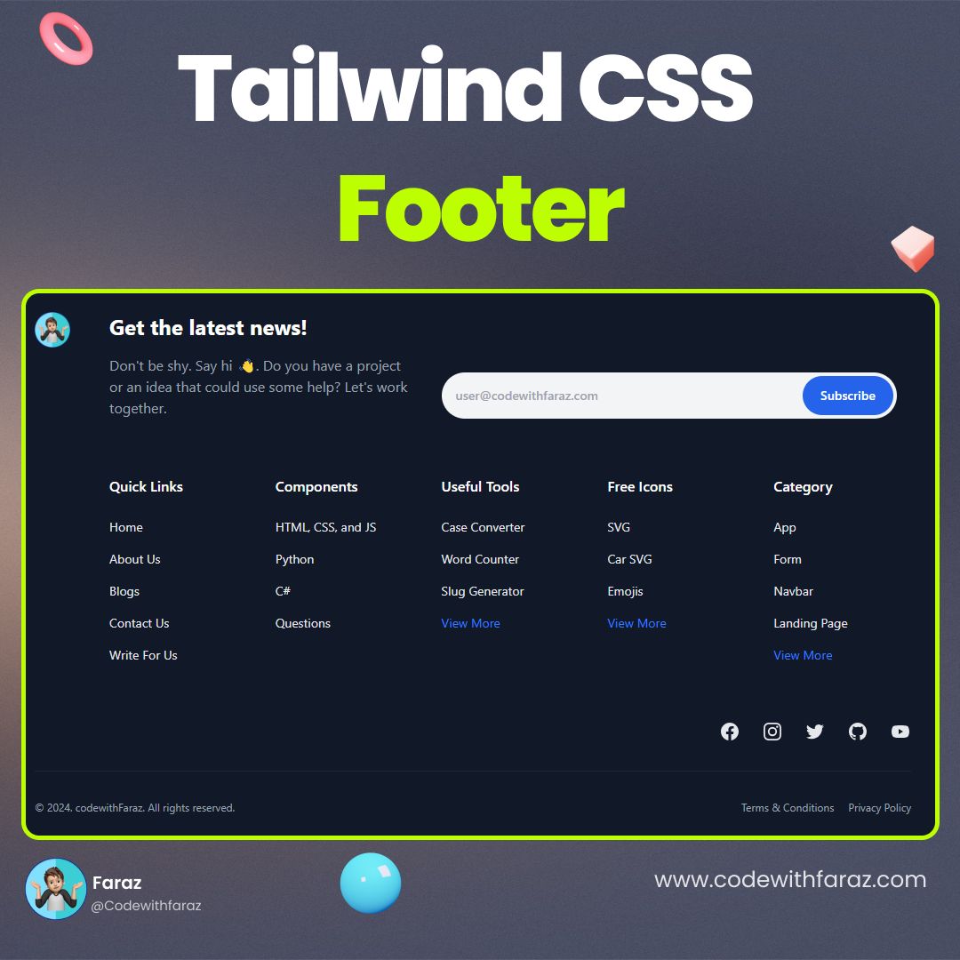
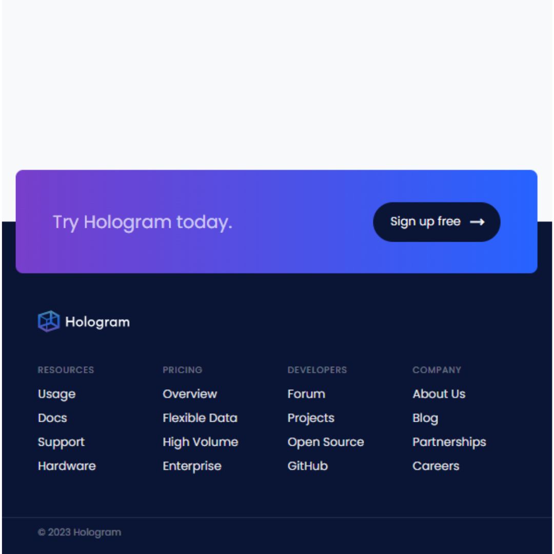
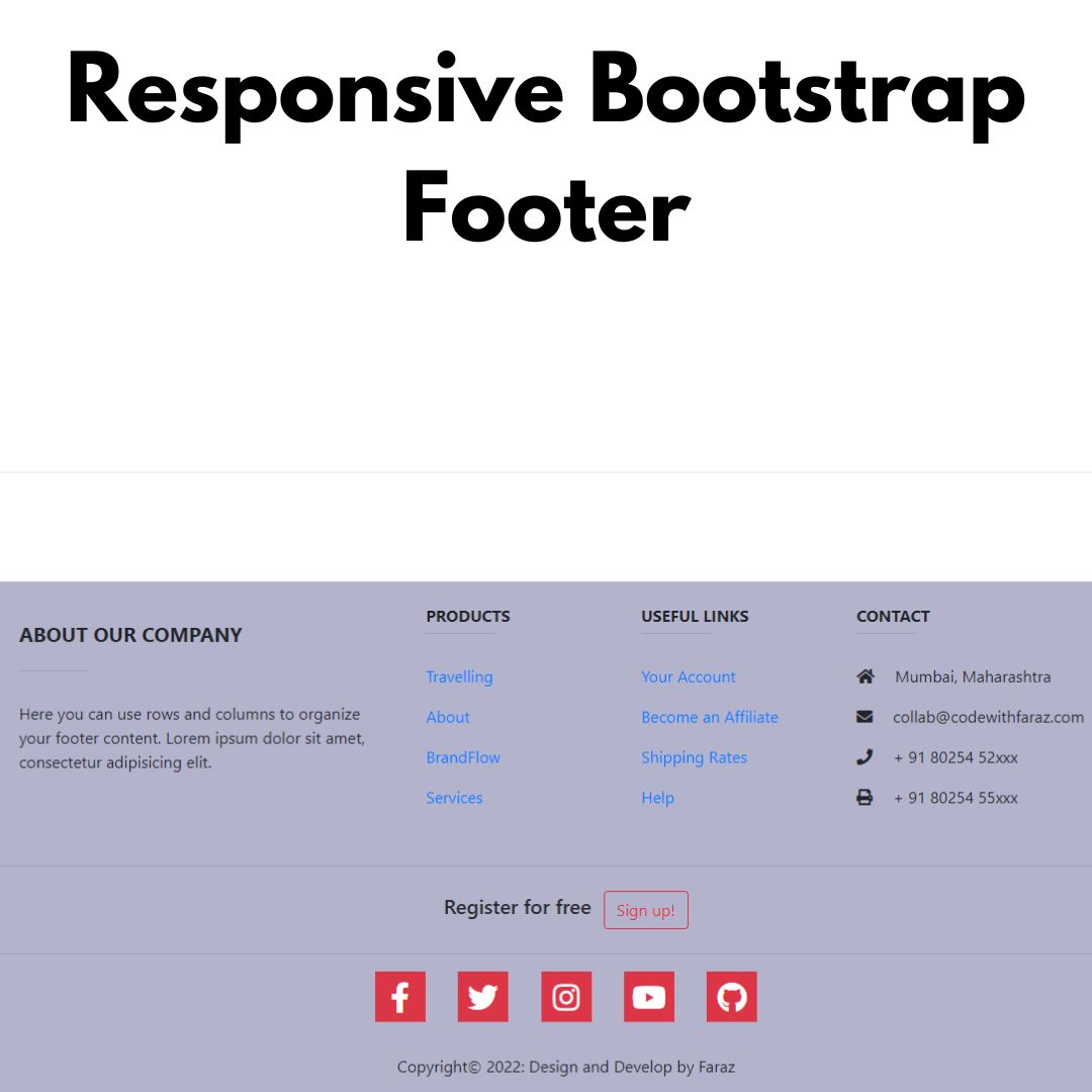
Elevate your website's UX with this premium, responsive header featuring a mega-menu, search bar, and animated hamburger menu. Get the free code snippet now!


Table of Contents
In modern web design, the header is more than just a list of links—it's the gateway to your site's user experience. A high-quality header must be responsive, visually striking, and functional across all devices.
In this guide, we will break down how to create a Premium Responsive Header featuring a glassmorphism effect, an expandable search bar, and a sleek mega-menu dropdown.
Prerequisites
Before we dive into the code, ensure you have a basic understanding of:
- HTML5 (Semantic structure)
- CSS3 (Flexbox and Transitions)
- JavaScript (DOM manipulation)
- External Assets: We use Phosphor Icons for a modern look.
Source Code
Step 1 (HTML Code):
The structure is divided into three main sections: the Logo, the Navigation Links (including the Mega Menu), and the Header Actions (Search and Call-to-Action).

Step 2 (CSS Code):
To achieve a "Premium" feel, we use Glassmorphism (backdrop-filter) and smooth transitions. The CSS handles the layout using Flexbox and ensures the mega-menu is perfectly aligned.
Key CSS Highlights:
- Glassmorphism:
backdrop-filter: blur(16px);creates that frosted glass look. - Hover Bridge: We use a pseudo-element (
::before) on the mega-menu to ensure the menu doesn't disappear when moving the mouse from the link to the dropdown. - Responsive Breakpoints: We use media queries to transform the horizontal list into a vertical mobile drawer with an accordion-style dropdown.
:root {
  --primary: #0f172a;
  --accent: #6366f1;
  --accent-soft: rgba(99, 102, 241, 0.1);
  --text-main: #1e293b;
  --text-muted: #64748b;
  --bg-glass: rgba(255, 255, 255, 0.85);
  --border-color: rgba(0, 0, 0, 0.06);
  --shadow-premium: 0 20px 25px -5px rgba(0, 0, 0, 0.05),
    0 10px 10px -5px rgba(0, 0, 0, 0.02);
  --transition-smooth: all 0.5s cubic-bezier(0.16, 1, 0.3, 1);
}

* {
  margin: 0;
  padding: 0;
  box-sizing: border-box;
  font-family: 'Inter', sans-serif;
}

body {
  background: #f8fafc;
  min-height: 200vh;
}

/* Header Container */
.header {
  position: fixed;
  top: 0;
  left: 0;
  width: 100%;
  height: 90px;
  background: var(--bg-glass);
  backdrop-filter: blur(16px);
  -webkit-backdrop-filter: blur(16px);
  border-bottom: 1px solid var(--border-color);
  z-index: 1000;
  display: flex;
  align-items: center;
  transition: var(--transition-smooth);
}

.header.scrolled {
  height: 70px;
  box-shadow: var(--shadow-premium);
}

.container {
  max-width: 1400px;
  margin: 0 auto;
  width: 100%;
  padding: 0 2rem;
  display: flex;
  align-items: center;
  justify-content: space-between;
}

/* Logo Area */
.logo {
  font-size: 1.4rem;
  font-weight: 800;
  color: var(--primary);
  text-decoration: none;
  display: flex;
  align-items: center;
  gap: 0.6rem;
  letter-spacing: -0.04em;
  z-index: 1001;
}

.logo-box {
  width: 32px;
  height: 32px;
  background: var(--primary);
  border-radius: 8px;
  display: flex;
  align-items: center;
  justify-content: center;
  color: white;
  transform: rotate(-10deg);
  transition: var(--transition-smooth);
}

.logo:hover .logo-box {
  transform: rotate(0deg) scale(1.1);
  background: var(--accent);
}

/* Navigation Links */
.nav-links {
  display: flex;
  gap: 0.5rem;
  list-style: none;
}

.nav-item {
  position: relative;
  padding: 1.5rem 0;
}

.nav-link {
  text-decoration: none;
  color: var(--text-main);
  font-size: 0.9rem;
  font-weight: 600;
  padding: 0.6rem 1rem;
  border-radius: 8px;
  transition: var(--transition-smooth);
  display: flex;
  align-items: center;
  justify-content: space-between;
  gap: 0.4rem;
}

.nav-link i {
  font-size: 0.8rem;
  transition: transform 0.3s ease;
}

.nav-link:hover {
  background: var(--accent-soft);
  color: var(--accent);
}

.nav-item:hover .nav-link i {
  transform: translateY(2px);
}

/* Mega Menu Dropdown (Desktop) */
.mega-menu {
  position: absolute;
  top: 100%;
  left: 0;
  width: 500px;
  background: white;
  border-radius: 16px;
  box-shadow: var(--shadow-premium);
  border: 1px solid var(--border-color);
  padding: 1.5rem;
  display: grid;
  grid-template-columns: 1fr 1fr;
  gap: 1rem;
  opacity: 0;
  visibility: hidden;
  transform: translateY(10px);
  transition: var(--transition-smooth);
  pointer-events: none;
}

.mega-menu::before {
  content: '';
  position: absolute;
  top: -20px;
  left: 0;
  width: 100%;
  height: 20px;
  background: transparent;
}

.nav-item:hover .mega-menu {
  opacity: 1;
  visibility: visible;
  transform: translateY(0);
  pointer-events: auto;
}

.menu-option {
  text-decoration: none;
  display: flex;
  gap: 1rem;
  padding: 1rem;
  border-radius: 12px;
  transition: var(--transition-smooth);
}

.menu-option:hover {
  background: #f8fafc;
}

.menu-icon {
  width: 40px;
  height: 40px;
  background: var(--accent-soft);
  color: var(--accent);
  border-radius: 10px;
  display: flex;
  align-items: center;
  justify-content: center;
  font-size: 1.2rem;
  flex-shrink: 0;
}

.menu-content h4 {
  font-size: 0.9rem;
  color: var(--primary);
  margin-bottom: 0.2rem;
}

.menu-content p {
  font-size: 0.75rem;
  color: var(--text-muted);
  line-height: 1.4;
}

/* Search & Actions */
.header-actions {
  display: flex;
  align-items: center;
  gap: 1.5rem;
  z-index: 1001;
}

/* Animated Search Bar */
.search-wrapper {
  position: relative;
  display: flex;
  align-items: center;
}

.search-input-container {
  width: 0;
  opacity: 0;
  overflow: hidden;
  transition: var(--transition-smooth);
  background: #f1f5f9;
  border-radius: 10px;
  display: flex;
  align-items: center;
}

.search-input-container.active {
  width: 240px;
  opacity: 1;
  padding: 0 0.8rem;
  margin-right: 0.5rem;
  border: 1px solid var(--accent);
  background: white;
}

.search-input {
  border: none;
  background: transparent;
  outline: none;
  padding: 0.6rem 0.2rem;
  font-size: 0.85rem;
  width: 100%;
  color: var(--text-main);
}

.search-trigger {
  background: none;
  border: none;
  font-size: 1.3rem;
  color: var(--text-main);
  cursor: pointer;
  transition: var(--transition-smooth);
  display: flex;
  align-items: center;
  justify-content: center;
}

.search-trigger:hover {
  color: var(--accent);
}

.btn-primary {
  background: var(--primary);
  color: white;
  padding: 0.7rem 1.4rem;
  border-radius: 10px;
  text-decoration: none;
  font-size: 0.9rem;
  font-weight: 600;
  transition: var(--transition-smooth);
  border: none;
  cursor: pointer;
}

.btn-primary:hover {
  background: var(--accent);
  transform: translateY(-2px);
  box-shadow: 0 10px 20px -5px rgba(99, 102, 241, 0.4);
}

/* Animated Hamburger Menu */
.menu-toggle {
  display: none;
  width: 30px;
  height: 20px;
  position: relative;
  cursor: pointer;
  background: none;
  border: none;
  outline: none;
}

.hamburger-bar {
  position: absolute;
  width: 100%;
  height: 2px;
  background: var(--primary);
  border-radius: 10px;
  transition: var(--transition-smooth);
}

.hamburger-bar:nth-child(1) {
  top: 0;
}
.hamburger-bar:nth-child(2) {
  top: 50%;
  transform: translateY(-50%);
}
.hamburger-bar:nth-child(3) {
  bottom: 0;
}

.menu-toggle.active .hamburger-bar:nth-child(1) {
  top: 50%;
  transform: translateY(-50%) rotate(45deg);
}
.menu-toggle.active .hamburger-bar:nth-child(2) {
  opacity: 0;
  transform: translateX(-20px);
}
.menu-toggle.active .hamburger-bar:nth-child(3) {
  bottom: 50%;
  transform: translateY(50%) rotate(-45deg);
}

/* Responsive Mobile Menu */
@media (max-width: 1024px) {
  .nav-links {
    position: fixed;
    top: 0;
    right: -100%;
    width: 100%;
    max-width: 400px;
    height: 100dvh;
    background: white;
    flex-direction: column;
    padding: 100px 1.5rem 2rem;
    gap: 0.5rem;
    transition: var(--transition-smooth);
    box-shadow: -10px 0 50px rgba(0, 0, 0, 0.1);
    overflow-y: auto;
    display: flex;
  }

  .nav-links.active {
    right: 0;
  }

  .nav-item {
    padding: 0;
    width: 100%;
    border-bottom: 1px solid #f1f5f9;
  }

  .nav-link {
    width: 100%;
    font-size: 1.05rem;
    padding: 1.2rem 0.5rem;
    border-radius: 0;
  }

  .mega-menu {
    position: static;
    transform: none;
    width: 100%;
    opacity: 1;
    visibility: visible;
    display: block;
    max-height: 0;
    overflow: hidden;
    grid-template-columns: 1fr;
    box-shadow: none;
    border: none;
    padding: 0 0.5rem;
    transition: var(--transition-smooth);
    background: #f8fafc;
    border-radius: 12px;
    pointer-events: auto;
  }

  .nav-item.mobile-open .mega-menu {
    max-height: 1000px;
    padding: 1rem 0.5rem;
    margin-bottom: 1rem;
  }

  .menu-toggle {
    display: block;
  }

  .header {
    height: 75px;
  }
  .btn-primary {
    display: none;
  }
}

.hero {
  padding: 200px 2rem 100px;
  text-align: center;
  max-width: 800px;
  margin: 0 auto;
}
.hero h1 {
  font-size: clamp(2.5rem, 5vw, 4rem);
  color: var(--primary);
  margin-bottom: 1.5rem;
  letter-spacing: -0.03em;
}
.hero p {
  color: var(--text-muted);
  font-size: 1.2rem;
  line-height: 1.6;
}
Step 3 (JavaScript Code):
JavaScript is the "brain" that makes the header interactive. We use it for three specific functions:
- Scroll Effect: Shrinking the header height when the user scrolls down for better visibility.
- Search Toggle: Expanding the input field when the magnifying glass is clicked.
- Mobile Menu Logic: Animating the hamburger bars into an "X" and sliding the navigation drawer into view.
const header = document.getElementById('mainHeader');
const menuToggle = document.getElementById('menuToggle');
const navLinks = document.getElementById('navLinks');
const searchTrigger = document.getElementById('searchTrigger');
const searchInputContainer = document.getElementById('searchInputContainer');
const searchIcon = document.getElementById('searchIcon');
const productsLink = document.getElementById('productsLink');

// Scroll Logic
window.addEventListener('scroll', () => {
  if (window.scrollY > 40) {
    header.classList.add('scrolled');
  } else {
    header.classList.remove('scrolled');
  }
});

// Search Bar Toggle Logic
searchTrigger.addEventListener('click', () => {
  searchInputContainer.classList.toggle('active');
  if (searchInputContainer.classList.contains('active')) {
    searchIcon.classList.remove('ph-magnifying-glass');
    searchIcon.classList.add('ph-x');
    searchInputContainer.querySelector('input').focus();
  } else {
    searchIcon.classList.remove('ph-x');
    searchIcon.classList.add('ph-magnifying-glass');
  }
});

// Hamburger Menu Toggle Logic
menuToggle.addEventListener('click', () => {
  menuToggle.classList.toggle('active');
  navLinks.classList.toggle('active');

  if (navLinks.classList.contains('active')) {
    document.body.style.overflow = 'hidden';
  } else {
    document.body.style.overflow = 'auto';
  }
});

// Mobile Mega Menu Toggle (Accordion Style)
productsLink.addEventListener('click', (e) => {
  if (window.innerWidth <= 1024) {
    e.preventDefault();
    const parent = productsLink.parentElement;
    parent.classList.toggle('mobile-open');

    const icon = productsLink.querySelector('i');
    icon.style.transform = parent.classList.contains('mobile-open')
      ? 'rotate(180deg)'
      : 'rotate(0deg)';
  }
});

// Close search or menu on Escape key
document.addEventListener('keydown', (e) => {
  if (e.key === 'Escape') {
    searchInputContainer.classList.remove('active');
    searchIcon.classList.remove('ph-x');
    searchIcon.classList.add('ph-magnifying-glass');

    menuToggle.classList.remove('active');
    navLinks.classList.remove('active');
    document.body.style.overflow = 'auto';
  }
});

// Show mobile CTA on small screens
const checkMobile = () => {
  const mobileCTA = document.getElementById('mobileCTA');
  if (window.innerWidth <= 1024) {
    mobileCTA.style.display = 'block';
  } else {
    mobileCTA.style.display = 'none';
    navLinks.classList.remove('active');
    menuToggle.classList.remove('active');
    document.body.style.overflow = 'auto';

    document.querySelectorAll('.nav-item').forEach((item) => {
      item.classList.remove('mobile-open');
      const icon = item.querySelector('i');
      if (icon) icon.style.transform = 'rotate(0deg)';
    });
  }
};

window.addEventListener('resize', checkMobile);
checkMobile();
Final Output:


Conclusion:
Building a premium header doesn't have to be complicated. By combining semantic HTML, modern CSS techniques like Glassmorphism, and simple JavaScript for interactivity, you can create a navigation experience that rivals top-tier SaaS platforms.
Pro Tip: Always test your header on real mobile devices to ensure the touch targets for your search bar and hamburger menu are easy to tap!
Enjoyed this snippet? Feel free to customise the colors and fonts to match your brand identity!
That’s a wrap!
I hope you enjoyed this post. Now, with these examples, you can create your own amazing page.
Did you like it? Let me know in the comments below 🔥 and you can support me by buying me a coffee
And don’t forget to sign up to our email newsletter so you can get useful content like this sent right to your inbox!
Thanks!
Faraz 😊