6 JavaScript Navbars
While CSS handles the styling of a navigation bar, JavaScript is essential for adding dynamic and responsive behaviors. JavaScript is used to create interactive features like toggling a mobile hamburger menu, making the navbar react to user scrolling, and highlighting active links on a single-page site. Common implementations involve using JavaScript to listen for scroll events to make a navbar 'sticky' after a certain point, or to hide it when scrolling down and reveal it when scrolling up. It also powers the click event that shows and hides the navigation links on smaller screens, a cornerstone of responsive design. This collection showcases a variety of navbars that use vanilla JavaScript to enhance their functionality. You'll find examples of sticky navbars, auto-hiding headers, and mobile-first navigation toggles. Explore these projects to learn how to build a more intelligent and user-friendly navigation experience.
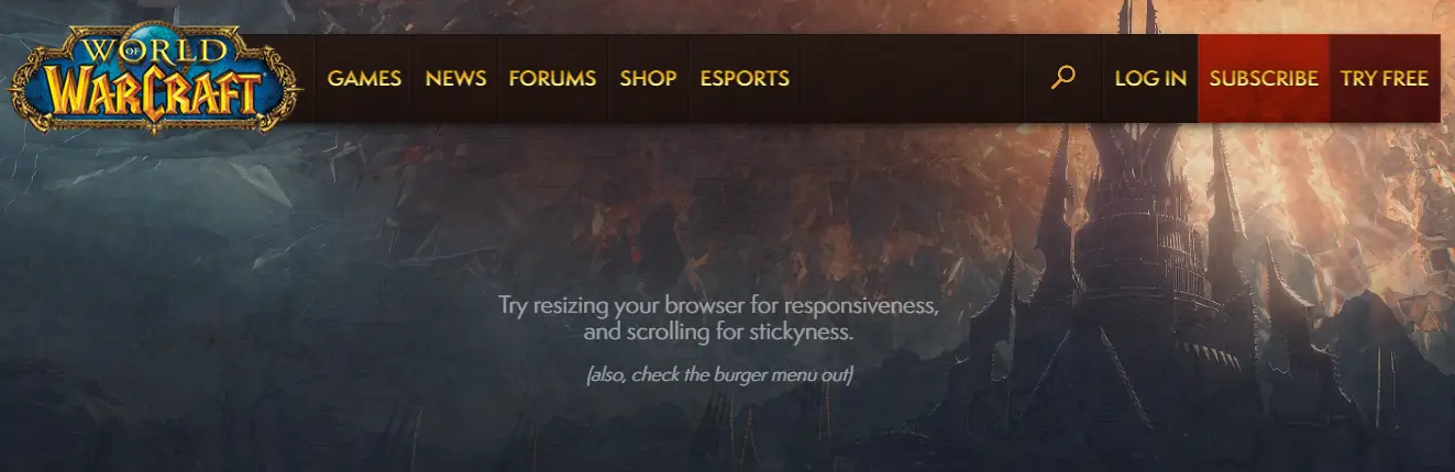
World of Warcraft Navigation Clone
A fully responsive, interactive navigation bar inspired by Blizzard Entertainment’s World of Warcraft website. Built with Pug, jQuery, and SVG icons, this project features a sticky header, burger menu for mobile devices, animated search input, and style-switch toggles to simulate different WoW expansions. The nav includes hover effects, submenu support, and dynamic scroll-based positioning.
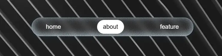
Frosted Glass Gooey Gravity Navigation
A visually stunning navigation bar featuring a frosted glass (glassmorphism) effect combined with gooey, gravity-inspired animations. Each nav item pops with a pill-shaped background on activation, and dynamic particle effects enhance the interaction. Built with layered noise textures, backdrop blur, and smooth CSS transitions, the nav delivers a tactile, almost liquid-like feel.

Swiper-Based Fullscreen Burger Menu
A stylish fullscreen burger menu built with HTML, CSS, and JavaScript using the Swiper.js library for smooth slide transitions between different menu sections. The design features a blurred background effect, animated burger icon transformation, and elegant navigation links that appear with a subtle delay for a refined motion effect.

Clash of Clans Navbar Clone
A Clash of Clans Navbar Clone is a web design component that replicates the user interface of the popular mobile game's navigation bar. Built with HTML, CSS, and JavaScript, its purpose is to provide a hands-on learning experience for developers to practice modern design techniques and create a visually appealing and interactive menu.
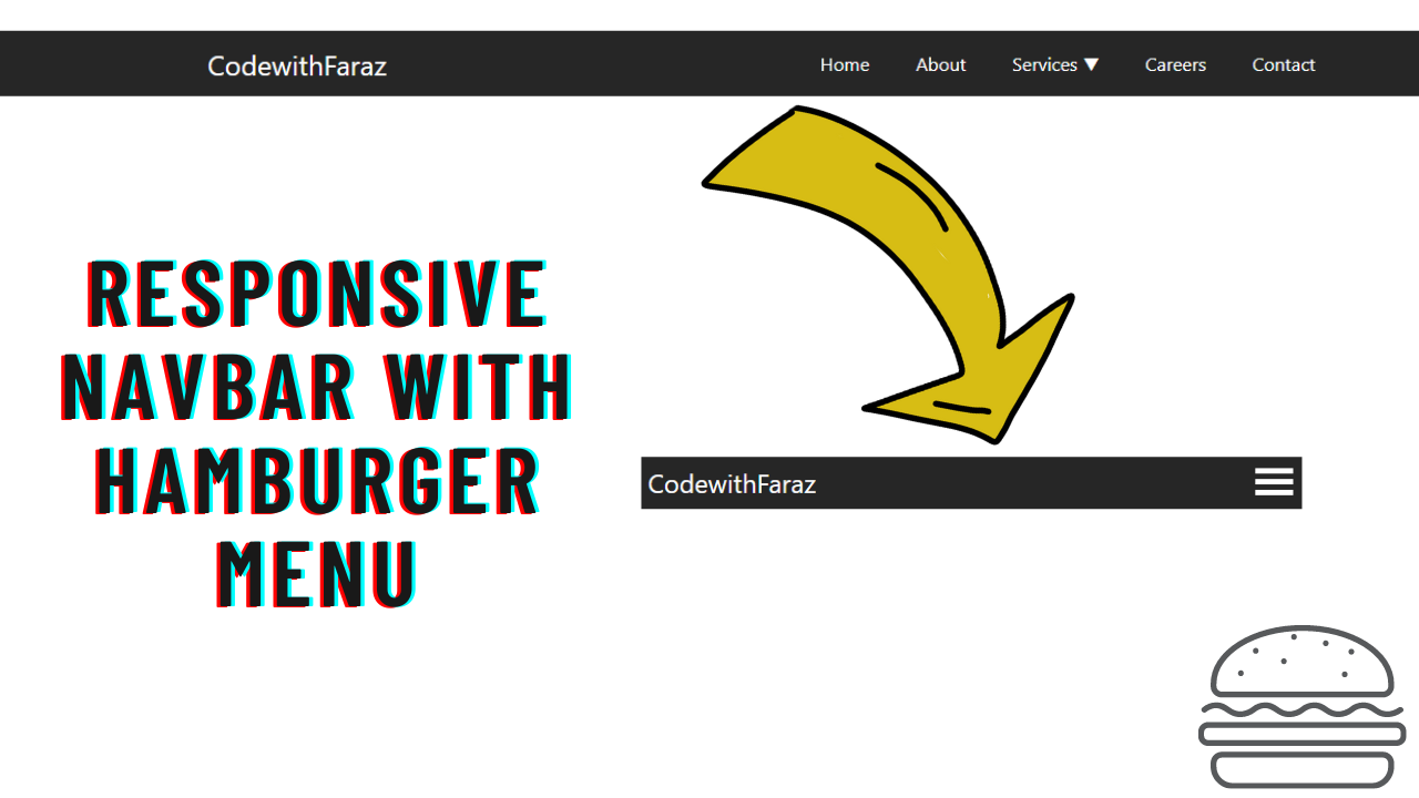
Navbar with Hamburger Menu
A Responsive Navbar with Hamburger Menu is a key web design component that provides a clean and intuitive navigation experience. Built with HTML, CSS, and JavaScript, its purpose is to create a professional and mobile-friendly menu that adapts seamlessly to different screen sizes. This design is crucial for improving user experience and site usability, as the hamburger menu icon allows for a compact and organized navigation panel on smaller devices, while expanding to a full menu on desktops.
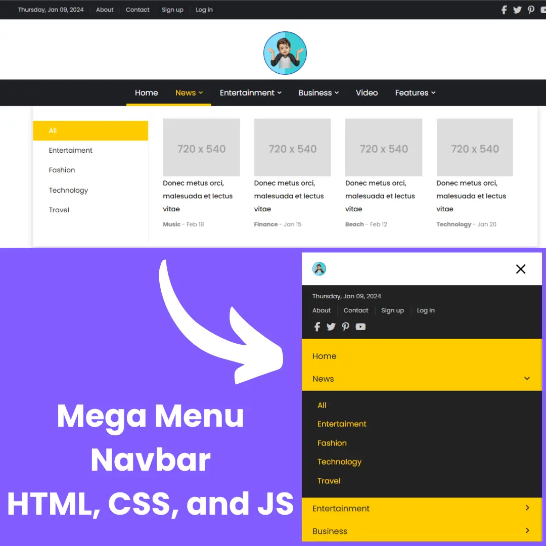
Mega Menu Navbar
A Mega Menu Navbar is an advanced web design component that displays a large dropdown menu, often with multiple subcategories and organized content. Built with HTML, CSS, and JavaScript, its purpose is to enhance user experience on websites with a lot of content. This menu makes navigation efficient and intuitive, allowing users to access various parts of a site without overwhelming the screen. It is a key feature for e-commerce sites and news portals.