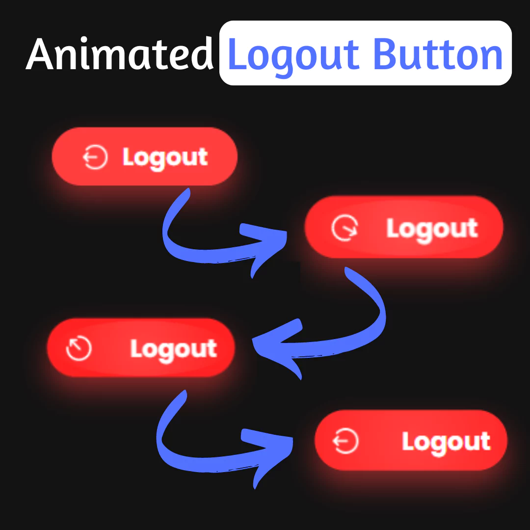
Learn how to create animated buttons with hover effects using HTML and CSS. Follow this step-by-step tutorial to make your buttons more interactive and engaging.

Table of Contents
An animated button with hover effects is a button that changes its appearance or behavior when the user hovers their mouse cursor over it.
If you want to add some twist to your page, CSS-animated button with hover effects is perfect. This helps improve the visitor's stay. Animated buttons encourage visitors to see what your site has to offer and make your page more dynamic. Apply these CSS animated buttons with hover effects and you will surely impress your visitors.
Watch full tutorial on my YouTube Channel: Watch Here.
Let's start making an amazing animated button with hover effects Using HTML and pure CSS step by step.
Source Code
Step 1 (HTML Code):
To get started, we will first need to create a basic HTML file. In this file, we will include the main structure for our animated button with hover effects.
After creating the files just paste the following codes into your file. Remember that you must save a file with the .html extension.
Step 2 (CSS Code):
Next, we will create our CSS file. In this file, we will use some basic CSS rules to create our animated button with hover effects. We will also add some padding and margin properties to ensure that everything looks correct.
This will give our animated button an upgraded presentation. Create a CSS file with the name of styles.css and paste the given codes into your CSS file. Remember that you must create a file with the .css extension.
*{
    margin: 0;
    padding: 0;
    box-sizing: border-box;
}

.container{
    width: 100%;
    min-height: 100vh;
    display: flex;
    justify-content: center;
    align-items: center;
    flex-direction: column;
    gap: 120px;
    background: #27282c;
}

.button{
    position: relative;
    padding: 15px 30px;
    font-size: 1.5rem;
    color: var(--color);
    border: 2px solid rgba(0,0,0,0.5);
    border-radius: 4px;
    text-shadow: 0 0 15px var(--color);
    text-decoration: none;
    text-transform: uppercase;
    letter-spacing: 0.1rem;
    transition: 0.5s;
    z-index: 1;
}

.button:hover{
    color: #fff;
    border: 2px solid rgba(0,0,0,0);
    box-shadow: 0 0 0px var(--color);
}

.button::before{
    content: "";
    position: absolute;
    top: 0;
    left: 0;
    width: 100%;
    height: 100%;
    background: var(--color);
    z-index: -1;
    transform: scale(0);
    transition: 0.5s;
}

.button:hover::before{
    transform: scale(1);
    transition-delay: 0.5s;
    box-shadow: 0 0 10px var(--color),
    0 0 30px var(--color), 0 0 60px var(--color);

}

.button span{
    position: absolute;
    background: var(--color);
    pointer-events: none;
    border-radius: 2px;
    box-shadow: 0 0 10px var(--color),
    0 0 20px var(--color),
    0 0 30px var(--color),
    0 0 50px var(--color),
    0 0 100px var(--color);
    transition: 0.5s ease-in-out;
    transition-delay: 0.25s;
}

.button:hover span{
    opacity: 0;
    transition-delay: 0s;
}

.button span:nth-child(1),
.button span:nth-child(3){
    width: 40px;
    height: 4px;
}

.button:hover span:nth-child(1),
.button:hover span:nth-child(3){
    transform: translateX(0);
}

.button span:nth-child(2),
.button span:nth-child(4){
    width: 4px;
    height: 40px;
}

.button span:nth-child(1){
    top: calc(50% - 2px);
    left: -50px;
    transform-origin: left;
}

.button:hover span:nth-child(1){
    left: 50%;
}

.button span:nth-child(3){
    top: calc(50% - 2px);
    right: -50px;
    transform-origin: right;
}

.button:hover span:nth-child(3){
    right: 50%;
}

.button span:nth-child(2){
    left: calc(50% - 2px);
    top: -50px;
    transform-origin: top;
}

.button:hover span:nth-child(2){
    top: 50%;
}

.button span:nth-child(4){
    left: calc(50% - 2px);
    bottom: -50px;
    transform-origin: bottom;
}

.button:hover span:nth-child(4){
    bottom: 50%;
}

@media screen and (min-width: 992px) {
    .container{
        flex-direction: row;
    }
}
Final Output:

Conclusion:
In conclusion, creating animated buttons with hover effects can make a significant difference in the user experience of your website or application. By following the step-by-step tutorial provided in this article, you can easily create buttons that are not only visually appealing but also interactive and engaging for users.
Remember to experiment with different styles and animations to find the perfect fit for your website or application. Additionally, keep in mind the importance of responsive design and accessibility when creating buttons.
We hope you found this tutorial helpful and informative. If you have any questions or suggestions, feel free to leave them in the comments below.
That’s a wrap!
I hope you enjoyed this post. Now, with these examples, you can create your own amazing page.
Did you like it? Let me know in the comments below 🔥 and you can support me by buying me a coffee
And don’t forget to sign up to our email newsletter so you can get useful content like this sent right to your inbox!
Thanks!
Faraz 😊
.jpg)


