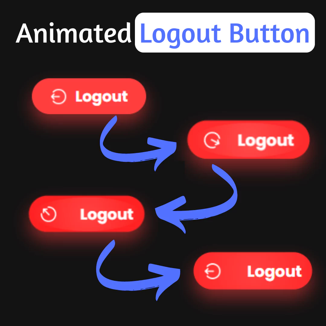
Learn how to create an eye-catching animated button for your website using HTML and CSS. A step-by-step guide with code examples is included.

Table of Contents
Animated buttons have become a staple in modern web design, offering a dynamic and engaging way to interact with users. Unlike traditional static buttons, animated buttons capture attention and entice users to take action. Whether it's a subtle hover effect or a bold animation, these buttons add personality and flair to websites, contributing to a more immersive user experience.
In this tutorial, we'll explore the process of creating a trending animated button using HTML and CSS. By following along, you'll learn how to infuse your buttons with motion and style, elevating your web design skills and captivating your audience. Let's dive in and unleash the potential of animated buttons!
Source Code
Step 1 (HTML Code):
To begin, create the HTML structure for the button. Use semantic markup to ensure accessibility and proper functionality across different devices and browsers.
How to do it:
- Open your preferred text editor.
- Create a new HTML file and name it appropriately.
- Use <button> tag to define the button element.
- Add relevant classes for styling and targeting with CSS.
Here's a breakdown of each part:
1. <!DOCTYPE html>: This declaration specifies the document type and version of HTML being used, which is HTML5 in this case.
2. <html lang="en">: This is the opening tag for the HTML document, with the lang attribute specifying the language as English.
3. <head>: This section contains metadata about the document, such as character encoding, viewport settings, and the title of the page.
- <meta charset="UTF-8" />: This meta tag specifies the character encoding of the document as UTF-8, which supports a wide range of characters from different languages.
- <meta name="viewport" content="width=device-width, initial-scale=1.0" />: This meta tag sets the viewport properties for responsive design. It tells the browser to set the width of the page to the width of the device and to set the initial zoom level to 1.0.
- <title>Button animation</title>: This sets the title of the web page displayed in the browser's title bar or tab.
- <link rel="stylesheet" href="styles.css" />: This line links an external stylesheet named "styles.css" to the HTML document. This stylesheet contains the CSS rules for styling the button and defining its animation.
4. <body>: This section contains the visible content of the web page.
- <button class="button">: This is a button element with a class attribute set to "button". This class corresponds to CSS rules defined in the linked stylesheet for styling and animating the button.
- <span>Play free</span>: This is a span element nested inside the button. It contains the text "Play free", which will be displayed on the button.
Step 2 (CSS Code):
Once the HTML structure is in place, it's time to style the button using CSS. This step involves defining the size, shape, colors, and typography of the button to achieve the desired visual aesthetic.
How to do it:
- Link the CSS file to your HTML document.
- Select the button element using its class or ID.
- Apply styles for background color, border, padding, font, etc.
- Use CSS techniques like a grid for layout control.
Let's break down the CSS code step by step:
1. The first block of code selects all elements, their ::before and ::after pseudo-elements, and sets their margin, padding, and box-sizing properties to 0 and inherit respectively. This effectively removes default spacing and ensures consistent box sizing across all elements.
2. The second block targets the <html> element and sets its box-sizing property to border-box. This ensures that padding and border are included in the element's total width and height, which helps maintain consistency in layout calculations.
3. The third block targets the <body> element and specifies its styles:
- Sets the height to 100vh, ensuring that the body fills the entire viewport height.
- Uses CSS Grid layout to center its content both horizontally and vertically.
- Sets the background color to #eee9ff.
4. The .button class styles buttons:
- Specifies the font family as "Space Grotesk" with a fallback to sans-serif.
- Converts text to uppercase.
- Sets a fixed width of 12.5rem.
- Removes background, padding, and border.
- Sets the cursor to pointer.
- Positions the button relatively.
- Applies isolation to create a new stacking context for the button.
5. The .button::before and .button::after pseudo-elements create the top and bottom borders of the button:
- They are absolutely positioned relative to the button.
- They cover the entire width of the button and have a height of 50% minus 3px.
- They have a 2px solid border color of #343232.
- The z-index is set to -1 to position them behind the button content.
6. The .button span selector styles the content inside the button:
- Displays it as a block element.
- Sets the background color to #343232.
- Sets the text color to #fff.
- Adds padding to the top and bottom (1rem) and left and right (2rem).
- Positions it relatively.
- Applies isolation to create a new stacking context.
- Sets overflow to hidden to prevent overflow.
- Adds a transition effect for color changes over 300ms.
7. The .button:hover span selector changes the text color to #343232 on hover, creating a color contrast with the button background.
8. The .button span::before and .button span::after pseudo-elements add decorative elements to the button content:
- .button span::before creates a diagonal background behind the text.
- .button span::after adds a small square at the bottom-right corner.
- Both pseudo-elements are absolutely positioned.
- .button span::before is initially skewed and translated off-screen to the left.
- Transitions are applied for smooth animations.
9. The hover effects for .button span::before and .button span::after adjust their properties to create animation effects on hover, such as removing skew and changing the background color.
*,
*::before,
*::after {
  margin: 0;
  padding: 0;
  box-sizing: inherit;
}
html {
  box-sizing: border-box;
}
body {
  height: 100vh;
  display: grid;
  place-content: center;
  background-color: #eee9ff;
}

.button {
  font-family: "Space Grotesk", sans-serif;
  text-transform: uppercase;
  width: 12.5rem;
  background: none;
  padding: 0.375rem;
  border: none;
  cursor: pointer;
  position: relative;
  isolation: isolate;
}
.button::before,
.button::after {
  content: "";
  position: absolute;
  left: 0;
  width: 100%;
  height: calc(50% - 3px);
  border: 2px solid #343232;
  z-index: -1;
}
.button::before {
  top: 0;
  border-bottom: 0;
}
.button::after {
  bottom: 0;
  border-top: 0;
}
.button span {
  display: block;
  background-color: #343232;
  color: #fff;
  padding: 1rem 2rem;
  position: relative;
  isolation: isolate;
  overflow: hidden;
  transition: color 300ms;
}
.button:hover span {
  color: #343232;
}
.button span::before,
.button span::after {
  content: "";
  position: absolute;
}
.button span::before {
  background-color: #b29cf9;
  inset: 0;
  z-index: -1;
  transform: translateX(calc(-100% - 2.5vw)) skew(-10deg);
  transition: transform 300ms;
}
.button:hover span::before {
  transform: none;
}
.button span::after {
  width: 0.375rem;
  height: 0.375rem;
  background-color: #b29cf9;
  right: 0;
  bottom: 0;
  transition: background-color 300ms;
}
.button:hover span::after {
  background-color: #343232;
}
Final Output:

Conclusion:
Congratulations! You've successfully created a trending animated button using HTML and CSS. By following this tutorial, you've learned valuable skills for enhancing user engagement and interactivity in web design. Experiment with different styles and effects to create unique buttons that captivate your audience. Happy coding!
Design and Code by: Julio
That’s a wrap!
I hope you enjoyed this post. Now, with these examples, you can create your own amazing page.
Did you like it? Let me know in the comments below 🔥 and you can support me by buying me a coffee
And don’t forget to sign up to our email newsletter so you can get useful content like this sent right to your inbox!
Thanks!
Faraz 😊


