3 Tailwind CSS Cards
Building card components with Tailwind CSS is a fast and flexible process. By combining utility classes for layout (Flexbox/Grid), shadows, borders, and typography, you can construct custom card designs for any purpose, such as product displays or blog post previews. This approach allows for rapid prototyping and iteration. Tailwind's responsive variants make it simple to create cards that adapt perfectly to different screen sizes. This collection showcases a variety of card designs built with Tailwind CSS. Explore different styles and layouts to find inspiration for your next project.

Thank You Card
This "Signature Collection" thank you card is designed to transform a standard post-purchase confirmation into a luxury brand experience. By blending high-end typography with modern web design trends, it creates a lasting impression of quality and care.

Ecommerce Product Card
A Modern E-commerce Product Card is a key web design component that displays a product with a clean, visually appealing, and organized layout. Built with HTML, Tailwind CSS, and JavaScript, its purpose is to create a dynamic and user-friendly online shopping experience. This card features a product image, name, price, and often includes interactive elements like a "Buy Now" or "Add to Cart" button, making it an essential feature for e-commerce sites to boost engagement and sales.
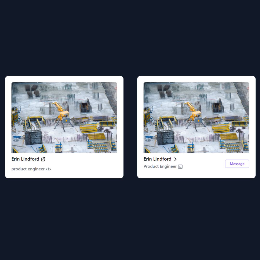
Responsive Card Layout
This is a responsive and accessible card component built using Tailwind CSS. It features a clean and modern design with a flexible layout that adapts seamlessly to different screen sizes. The card includes an image, title, description, and a call-to-action button, making it ideal for showcasing products, blog posts, or team members.