2 Tailwind CSS Buttons
Tailwind CSS excels at creating custom button designs with its extensive set of utility classes. You can easily compose classes for background color, text size, padding, shadows, and hover states directly in your HTML. This allows for rapid development of a consistent and unique set of buttons for your project. The utility-first workflow eliminates the need for custom button CSS files, making your codebase easier to maintain. This collection features a wide variety of button designs created with Tailwind CSS, from simple solid buttons to complex ghost and gradient buttons with hover effects.
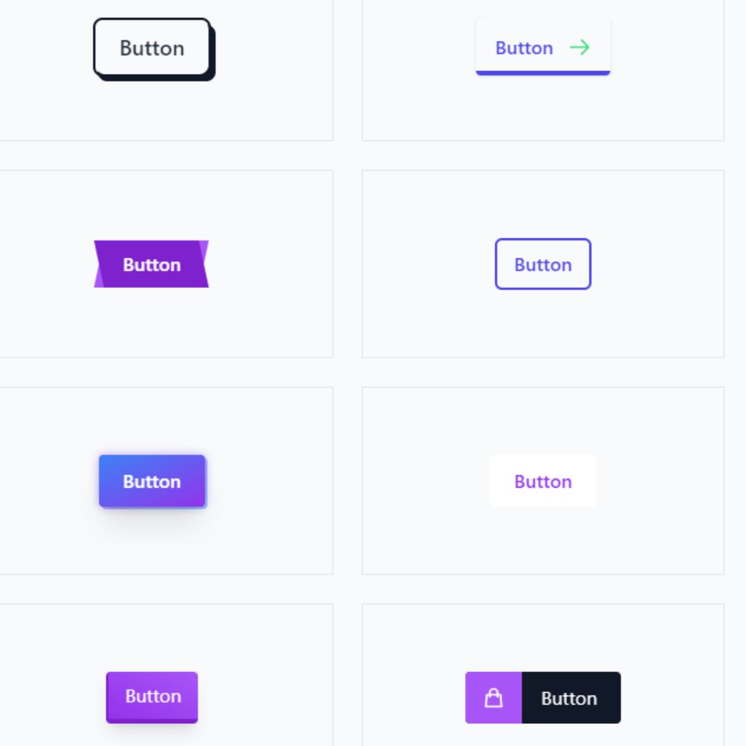
Modern Buttons
A collection of Modern Buttons built with the Tailwind CSS framework provides developers with a versatile set of tools for creating stunning and interactive user interfaces. These buttons, which come in a variety of styles, shapes, and colors, are designed to serve as a gateway to user interactions. With features like animations and hover effects, they not only enhance a website's visual appeal but also improve the overall user experience.
Social Share Button with Hover Reveal
A stylish share button that reveals social media icons on hover. The button initially shows the text “Share” with a share icon, and when hovered, the text slides up and fades out while the Twitter, Facebook, and LinkedIn icons smoothly slide in and fade in with a cascading effect, creating a modern and interactive dropdown-style button ideal for boosting user engagement on websites.