9 JavaScript Sidebars
JavaScript is key to creating interactive sidebars, especially collapsible or off-canvas sidebars common in dashboards and mobile applications. It is used to manage the state of the sidebar (open or closed) and handles the click event on a toggle button to show or hide the sidebar, often with a smooth CSS transition. This functionality is crucial for creating responsive layouts that maximize screen real estate. This collection showcases interactive sidebars built with JavaScript. Explore examples of collapsible and off-canvas navigation panels.

Collapsible Sidebar with Search & Tree Navigation
A responsive collapsible sidebar layout featuring a sticky header, search input, and a tree-style navigation menu. The sidebar includes a logo, a dynamic search bar for filtering menu items, and interactive tree components generated via <sidebar-tree>. Perfect for dashboards, educational platforms, or web applications that require a clean, organized, and searchable navigation panel.

Responsive Pinned Sidebar Layout
A fully responsive web layout featuring a pinned sidebar, collapsible mobile navigation, and sticky header. The sidebar includes a dynamic tree-style menu, search functionality, and footer with user info, feedback, and settings buttons.

Expandable Sidebar Navigation with Active Highlight
A modern, collapsible sidebar featuring smooth open/close animations, a search bar, and icon-based menu items. The sidebar highlights the active section with a colored indicator that moves dynamically, providing clear visual feedback. Built with HTML, CSS, and JavaScript, it supports both compact and expanded views, making it perfect for dashboards, admin panels, or web apps where space optimization and intuitive navigation are essential.

Collapsible Sidebar with Nested Dropdown Menus
A sleek and interactive sidebar featuring nested dropdown menus with smooth expand/collapse animations and icon-based navigation. Built using HTML, CSS, and JavaScript, it supports multiple submenus like Settings, Create, and Profile, ensuring only one submenu is open at a time for a clean user experience. With modern glassmorphism styling, hover effects, and rotating arrow indicators, it is ideal for dashboards, admin panels, or web apps, offering both functionality and a polished, professional look.

Resizable Sidebar
A clean, modern sidebar with a vertical layout that supports dynamic resizing using a draggable handle. It features a white background with subtle hover effects that highlight menu items, a set of Material Symbols icons for intuitive navigation, and options for Apps, File Manager, JSON Generator, Settings, Favorite Videos, and Ratings Wizards.
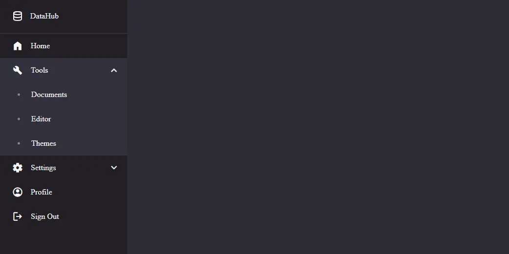
DataHub Sidebar
A sleek, dark-themed sidebar layout designed for dashboard or productivity apps, featuring collapsible submenus for Tools and Settings, a fixed vertical menu with icons and labels, smooth expand/collapse animations, and easy access to Home, Profile, and Sign Out options. The sidebar uses subtle hover effects, clean spacing, and modern typography for a professional, organized user interface.
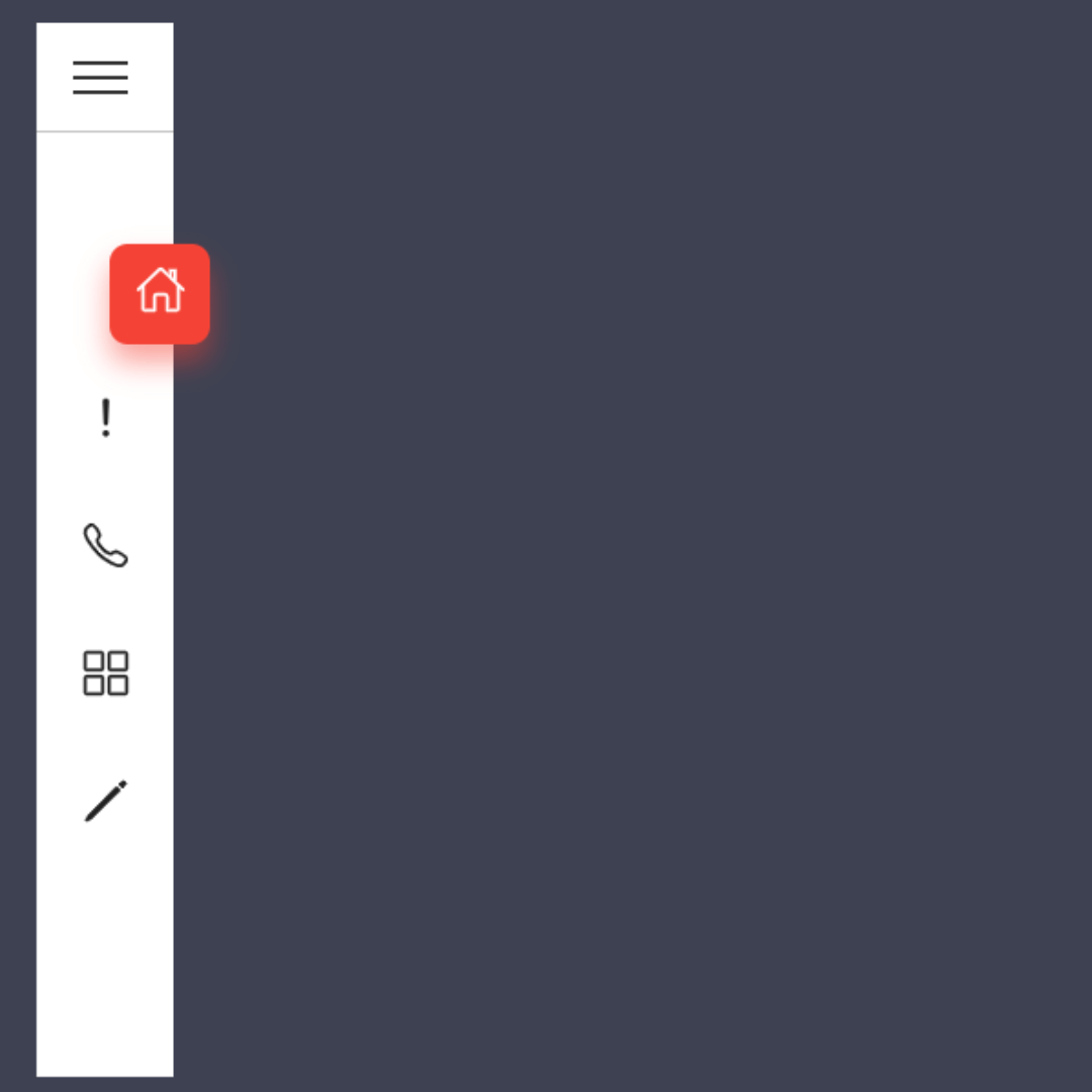
Sidebar Menu
A Stylish Sidebar Menu is a key web design component that provides a clean, collapsible navigation panel for a website. Built with HTML, CSS, and JavaScript, its purpose is to improve the user experience by organizing a site's content in an efficient and visually appealing way. This menu is perfect for content-heavy websites and web applications, as it allows users to access different sections without cluttering the main screen.
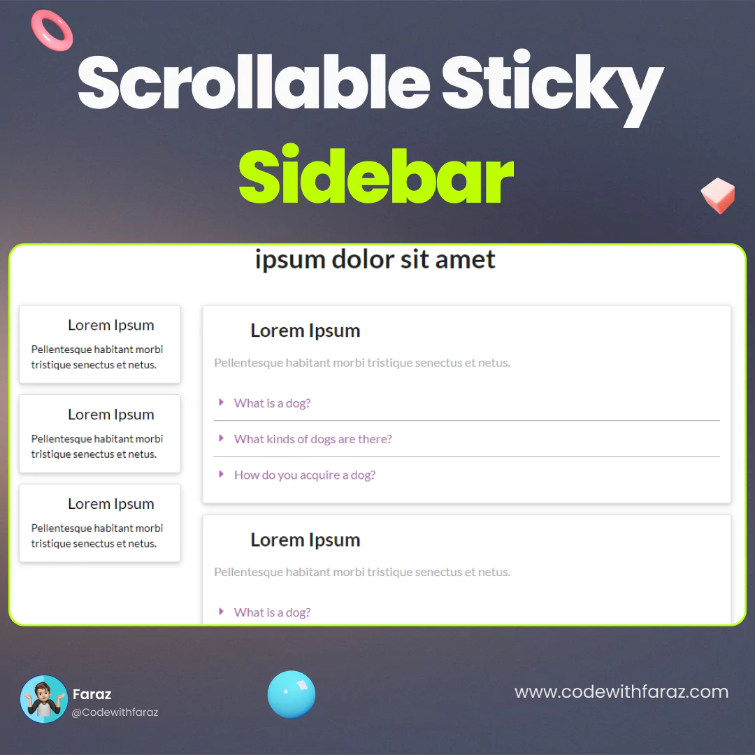
Scrollable Sticky Sidebar
A Scrollable Sticky Sidebar is a modern web design component that combines a sidebar's ability to be scrollable with the "sticky" effect, which keeps it in a fixed position on the screen. Built with HTML, CSS, and JavaScript, its purpose is to enhance user experience and navigation on content-heavy pages. This component allows users to scroll through the sidebar's content while keeping it visible on the screen, providing easy access to key links or information without disrupting the main content.

YouTube Sidebar
A YouTube Sidebar is a responsive navigation component that organizes website content in a compact, collapsible menu. Built with HTML for its structure, CSS for its design, and JavaScript for its interactive functionality, its purpose is to improve user experience by making site navigation clean and efficient. This design is particularly useful for content-heavy platforms, as it allows users to access different categories and features without cluttering the main screen.