4 JavaScript Charts
JavaScript is the engine behind interactive data visualization on the web. Using powerful libraries like Chart.js, D3.js, or ApexCharts, developers can transform raw data into beautiful and interactive charts and graphs. These libraries handle the complex task of rendering data onto an HTML canvas or SVG, allowing for tooltips, animations, and real-time updates. Interactive charts are essential for analytics dashboards, financial reports, and any application that needs to present data in an engaging, understandable way. This collection showcases a variety of stunning charts and graphs created with different JavaScript libraries. Explore examples of bar charts, line graphs, and pie charts to learn about data visualization.

User Growth Area Chart
A clean and modern area chart built with ApexCharts and CSS, perfect for visualizing user growth trends with smooth gradients and a minimal dark dashboard style.

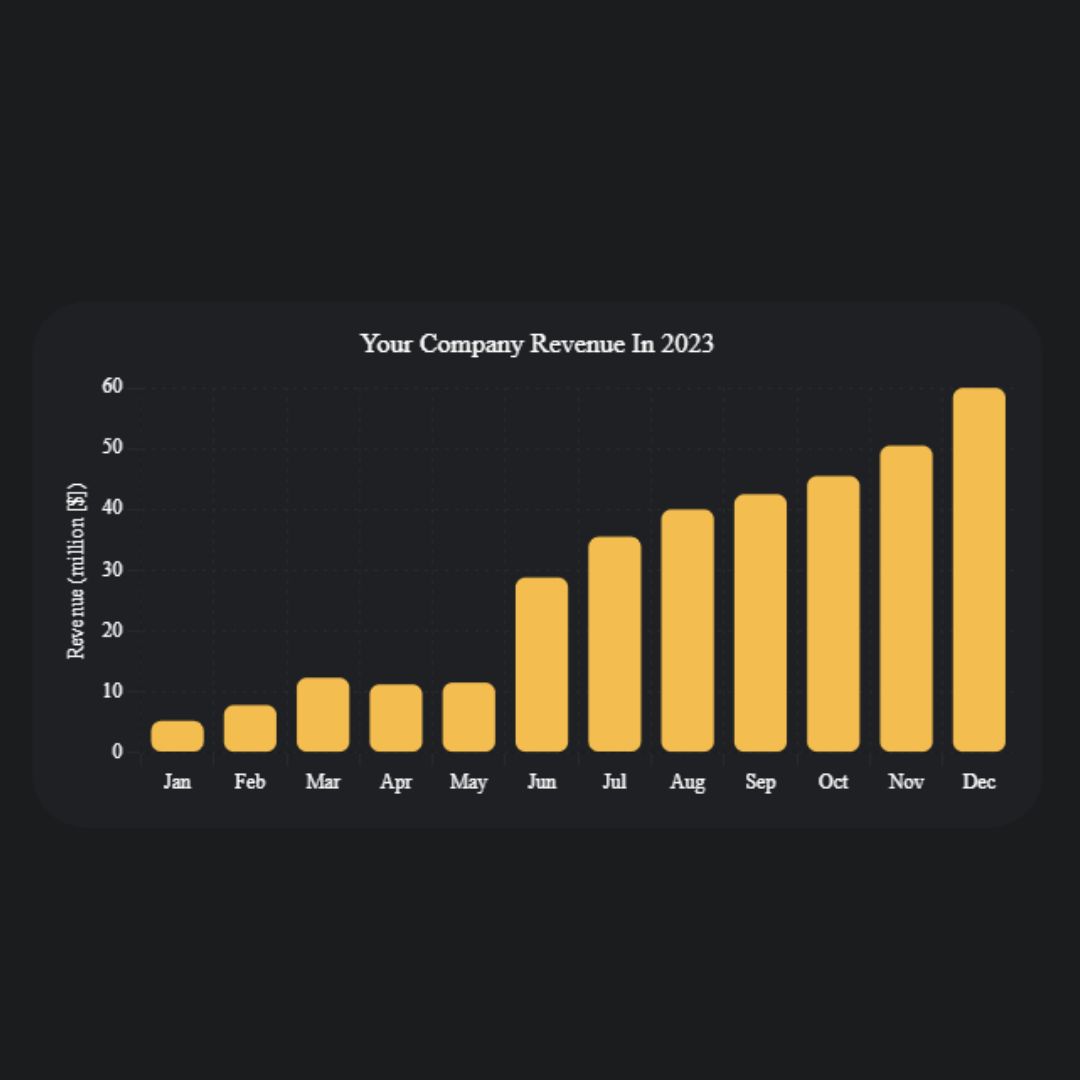
User Growth Bar Chart
A clean and modern bar chart built with ApexCharts and CSS, perfect for comparing user growth data between years. It features smooth rounded bars, subtle colors, and a minimal white card design for dashboards and analytics pages.
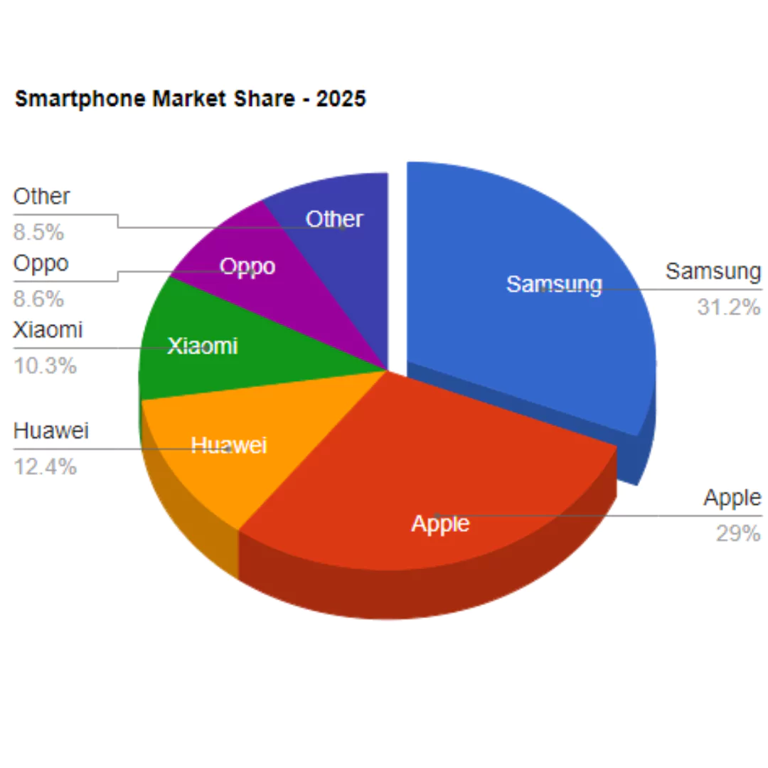
Pie Chart using Loader.js
A Pie Chart created using a library like Loader.js is a dynamic web component that visualizes data in a circular graph. Its purpose is to present data as a proportion of a whole in a clear and engaging way. This tool is built with HTML, CSS, and JavaScript, and the use of a specialized library simplifies the process of creating and animating a visually appealing pie chart. It's a great feature for dashboards, data reports, or infographics to help users easily understand statistical information.
Responsive Chart
A Responsive Chart is a dynamic web component that visualizes data in a clear and interactive way. Using HTML and CSS for the structure and styling, its core functionality is powered by the Chart.js library, which allows it to create various chart types like line, bar, or pie charts.