8 CSS Grid Layouts
CSS Grid is a revolutionary two-dimensional layout system that allows for the creation of complex and responsive web page layouts with unprecedented control. It simplifies the process of designing grids, enabling developers to align items into rows and columns easily. It's perfect for creating everything from entire page layouts to smaller UI components. Mastering CSS Grid is a fundamental skill for modern web developers. This collection showcases a variety of powerful and creative examples built with CSS Grid. Explore everything from image galleries and card layouts to complex magazine-style designs to understand the full potential of this layout system.

3D Connected Grid Boxes
A visually striking 3D-inspired grid layout using CSS Grid and gradients to create connected boxes with depth and layered effects. Each box can contain multiple items, arranged vertically, and is styled with vibrant linear gradients and smooth rounded corners. White connector lines and directional arrows (FontAwesome icons) give a sense of flow and continuity between the boxes.

Dynamic Mosaic Grid Gallery
A visually striking mosaic-style image gallery built with CSS Grid, featuring overlapping and variably sized tiles that create a dynamic, collage-like layout. Each tile can span multiple rows and columns, allowing for unique arrangements of images. The gallery is fully responsive, centered on the viewport, and uses smooth scaling and rotation effects to enhance presentation.
Shopping Cart Layout
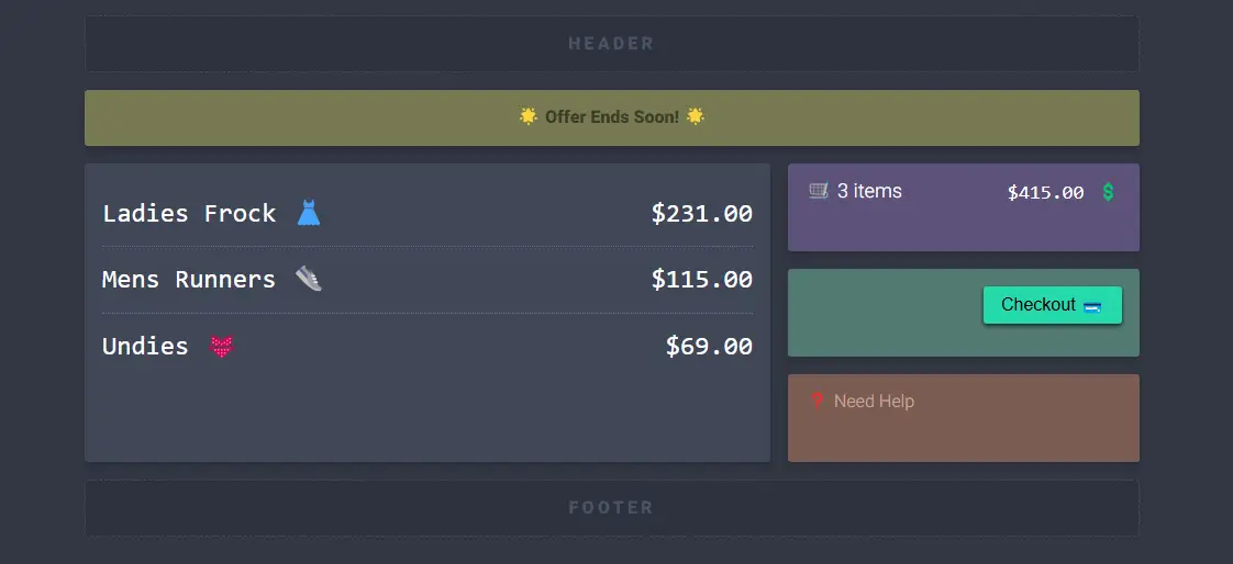
A clean and responsive shopping cart interface built with CSS Grid and modern styling. The layout includes a summary section showing total items and price, an itemized cart with product names and prices, a checkout button, promotional offers, and a help section. It adapts seamlessly for larger screens with a two-column layout while maintaining readability on smaller devices.

Hexagonal Image Grid
A fully responsive hexagonal image gallery built purely with CSS grid, requiring no media queries. Each hex cell displays an image with optional custom object positioning, creating a visually dynamic layout. The grid automatically calculates the number of columns and offsets for even and odd rows to maintain the hex pattern. Hover effects scale and saturate images for interactivity, while the layout remains fluid across screen sizes.

Hexagonal Image Gallery Grid
A creative hexagon-shaped image gallery built using CSS Grid and clip-path to form perfect hexagonal cells. The layout adjusts dynamically based on the number of rows and columns, making it flexible for any screen size. Each image smoothly scales and brightens on hover, creating a modern and eye-catching 3D effect. This hexagonal grid is ideal for photography portfolios, creative showcases, or background layouts that need a unique geometric aesthetic.

Circular Grid
A Circular Grid with a Hover Effect is a creative web design component that displays content in a circular, grid-like pattern. Built with HTML for the structure and CSS for styling, its purpose is to create a visually stunning and interactive user experience. This design uses CSS properties to arrange elements in a circular shape, with a hover effect that makes the grid elements expand or change color.

Comic Book Style Grid Layout
A Comic Book Style Grid Layout is a creative web design component that organizes content into a dynamic, panel-based grid, similar to the pages of a comic book. Built with HTML and CSS, its purpose is to create a visually engaging and unique user experience. This design uses CSS grid properties to arrange images and text in an unconventional way, making it an excellent project for developers to practice modern layout techniques and create a memorable and artistic web presence.

Grid List with Hover Effect
Grid List with Hover Effect is a visually appealing grid list created using HTML and CSS, featuring interactive hover effects that enhance user experience. The grid adapts responsively to different screen sizes, ensuring a seamless display across devices.