8 CSS Footers
The website footer is a vital section for secondary navigation and information. Using CSS, particularly modern layout techniques like Flexbox and Grid, you can design footers that are responsive, well-organized, and visually appealing. CSS provides complete control over the footer's typography, color scheme, and spacing. A well-designed footer built with CSS will adapt seamlessly to different screen sizes, ensuring that important links and information are always accessible. This collection showcases various footer designs created with pure CSS. Discover different layouts, from minimalist to multi-column, to create a professional footer for your site.

Interactive Hero Footer with Fancy Buttons
A modern footer layout combining a bold hero section with a vibrant background, animated background image, and standout “Let's Chat” button featuring a decorative dotted border effect. The content area includes a structured navigation menu, logo placement, and a secondary call-to-action button for contacting sales, designed to be fully responsive and visually engaging with clean typography and balanced spacing, making it ideal for professional UI collections and component libraries.

Animated Wavy Footer with Social Links
A visually striking footer design featuring animated SVG waves in the background, a central call-to-action section with a blurred, semi-transparent button, and a structured bottom section with a logo, social media icons, and multi-column navigation links.

Gradient Hero Footer with CTA
A visually striking, full-height footer with a blurred background gradient overlaying an image. At the top, a centered call-to-action section invites users to “Get started,” featuring a heading and subheading. The bottom section contains the company logo, social media icons, and organized navigational links divided into sections like “FOREST.AI,” “PRODUCT,” and “CONTACT.”

Gradient Multi-Section Footer
A modern website footer featuring a vibrant gradient background with a fixed position at the bottom of the page. It includes sections for the company logo, social media links, navigational links for services, resources, and company info, along with a contact address. Fully responsive, the layout adjusts across devices to maintain accessibility and a clean visual structure.

Multi-Column Footer with Social Media
A modern footer with a clean, dark-themed design, built using HTML and CSS. The footer features a top section with the company logo, three columns of links for “Get Started,” “Resources,” and “Social Media,” including icons for Facebook, Instagram, and LinkedIn. The bottom section displays copyright information and legal links such as License, Terms, and Privacy. On smaller screens, the footer stacks the columns and hides the headings and descriptions in the social column, while on larger screens it displays them in a three-column layout.
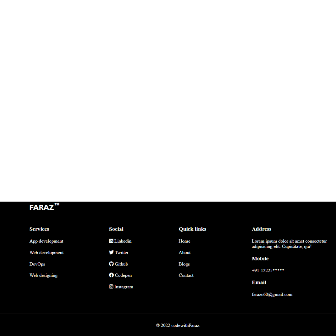
Footer #2
A Pure CSS Responsive Footer is a fundamental web design component that provides a website with a clean and organized conclusion. Built with HTML and CSS, its purpose is to ensure that a website’s essential information, such as contact details, navigation links, and social media icons, are easily accessible on all devices.
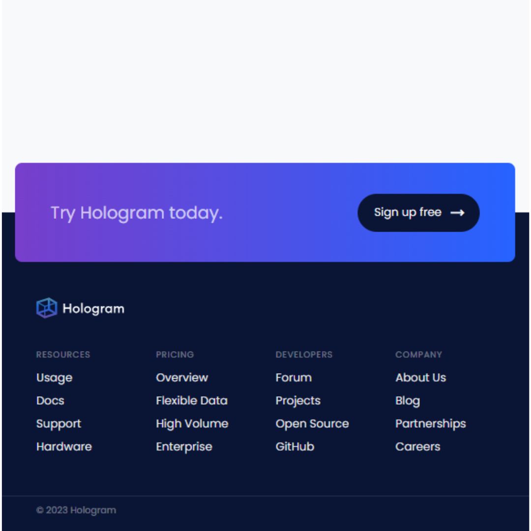
Footer
A Responsive Footer is a crucial web design component that provides a website with a clean and organized conclusion. Created with HTML for its structure and CSS for styling, its purpose is to ensure that a website’s essential information, such as contact details, navigation links, and social media icons, are easily accessible on all devices.
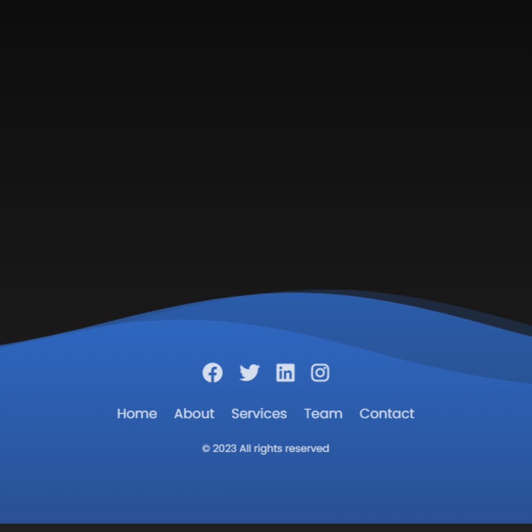
Animated Footer
An Animated Footer is a dynamic web design element that adds a captivating visual effect to the bottom of a website. Built with HTML for structure and CSS for styling, its purpose is to enhance user engagement and navigation. It often features elements like animated waves, smooth transitions, and other dynamic effects that not only make the site more elegant and memorable but also help guide users to important links and calls-to-action.