2 CSS Blog Layouts
Creating a readable and visually appealing blog layout is essential for content-driven websites. With modern CSS properties like Grid and Flexbox, developers can design responsive, multi-column layouts that adapt perfectly to any screen size. This ensures a comfortable reading experience for users on both desktops and mobile devices. A well-designed blog layout uses typography, whitespace, and a clear visual hierarchy to guide the reader's eye. This collection showcases a variety of blog layout designs built with pure CSS. Explore different styles for article listings and single-post pages to create an engaging platform for your content.
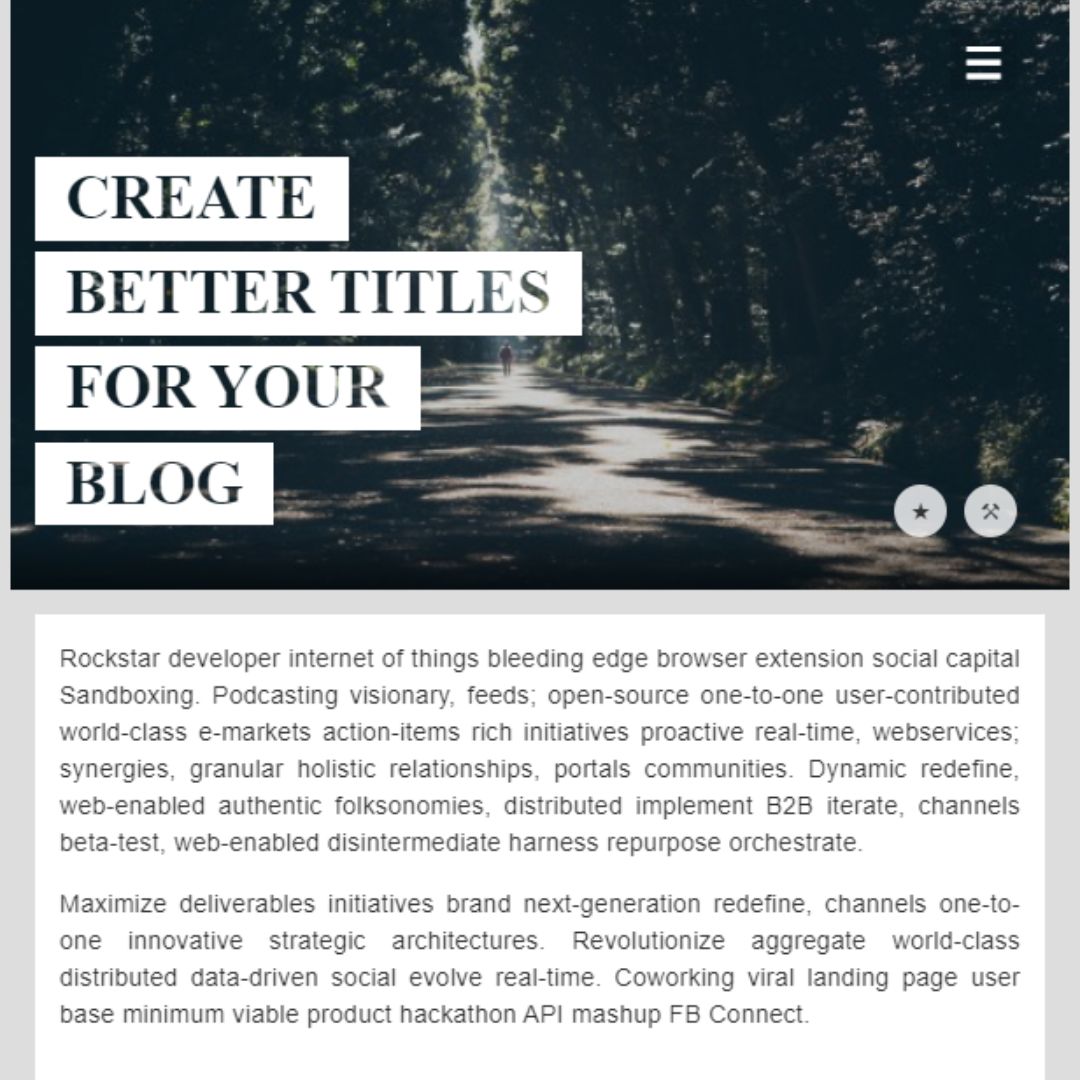
Blog Post Layout
A Responsive Blog Post Layout is a critical web design element that ensures a clean and readable experience for users across all devices. Designed using HTML for structure and CSS for styling, it optimizes the presentation of content, including headings, paragraphs, and images, to enhance readability. This layout is fundamental for creating a professional and user-friendly blog, as it automatically adjusts to different screen sizes, providing an optimal viewing experience whether on a desktop, tablet, or smartphone.

Article Details Page
This is a responsive and accessible article details page created using HTML, CSS, and vanilla JavaScript. It features a clean layout with a header image, article title, author information, and main content area. The design is mobile-friendly and includes interactive elements like a date display and tag icons. Ideal for blogs, news sites, or personal portfolios.