2 Bootstrap Cards
The Bootstrap card is a flexible and powerful content container, acting as a fundamental building block for modern user interfaces. It replaces older components like panels and wells, providing a single, adaptable component for displaying everything from product information to user profiles in a clean, boxed format. Built with flexbox, Bootstrap cards offer incredible layout flexibility. They can include headers, footers, images, text, and lists, and can be easily arranged into responsive grids or columns. This makes them perfect for creating organized, scannable content on e-commerce sites, blogs, and dashboards. This collection showcases a wide variety of Bootstrap card examples. Discover different styles, from basic content cards to interactive product cards with hover effects and horizontal layouts. Explore these templates to quickly implement professional and versatile card components in your projects.
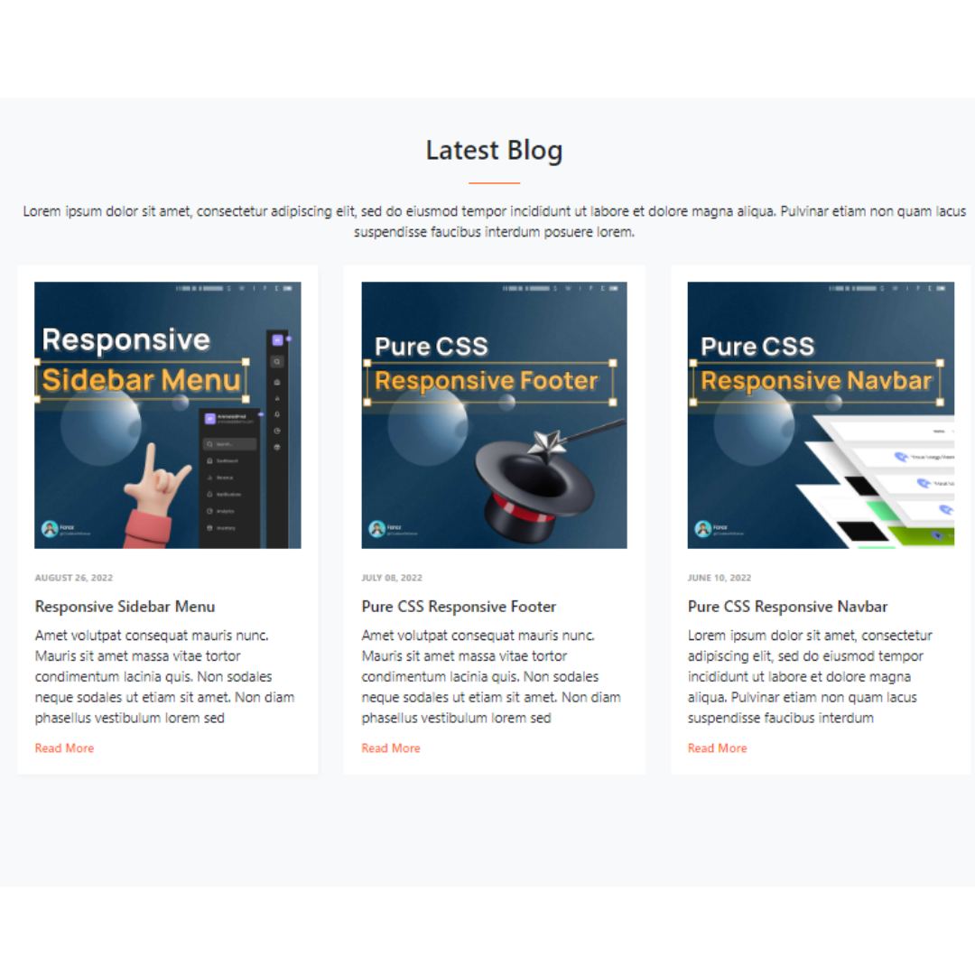
Simple Responsive Blog Cards
A Simple Responsive Blog Card is a web design component that displays a blog post's title, image, and a short description. Built with Bootstrap 4 and HTML, its purpose is to create a clean, modern, and mobile-friendly layout for a blog's content.
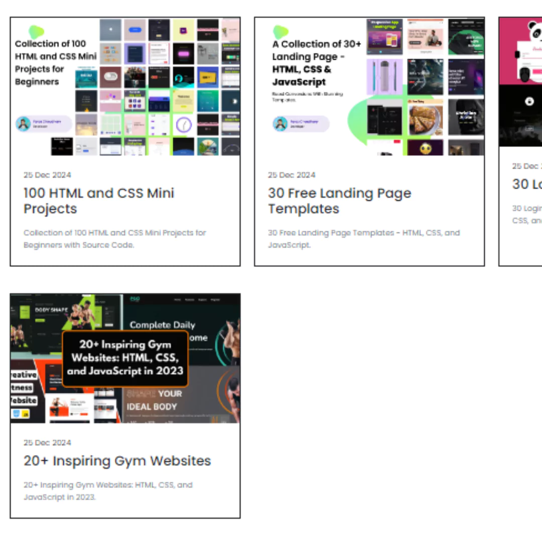
Grid Card Layout
A Grid Card Layout is a fundamental web design component that organizes and displays content in a series of clean, uniform cards. Built with HTML and the Bootstrap framework, its purpose is to create a responsive and organized layout. The grid system automatically adjusts the card's size and position to fit different screen sizes, from desktops to mobile phones, making it a key feature for e-commerce sites, blogs, and galleries to improve user experience.