Learn how to create a toggle switch button using HTML and pure CSS with this easy-to-follow tutorial. No JavaScript required!

Table of Contents
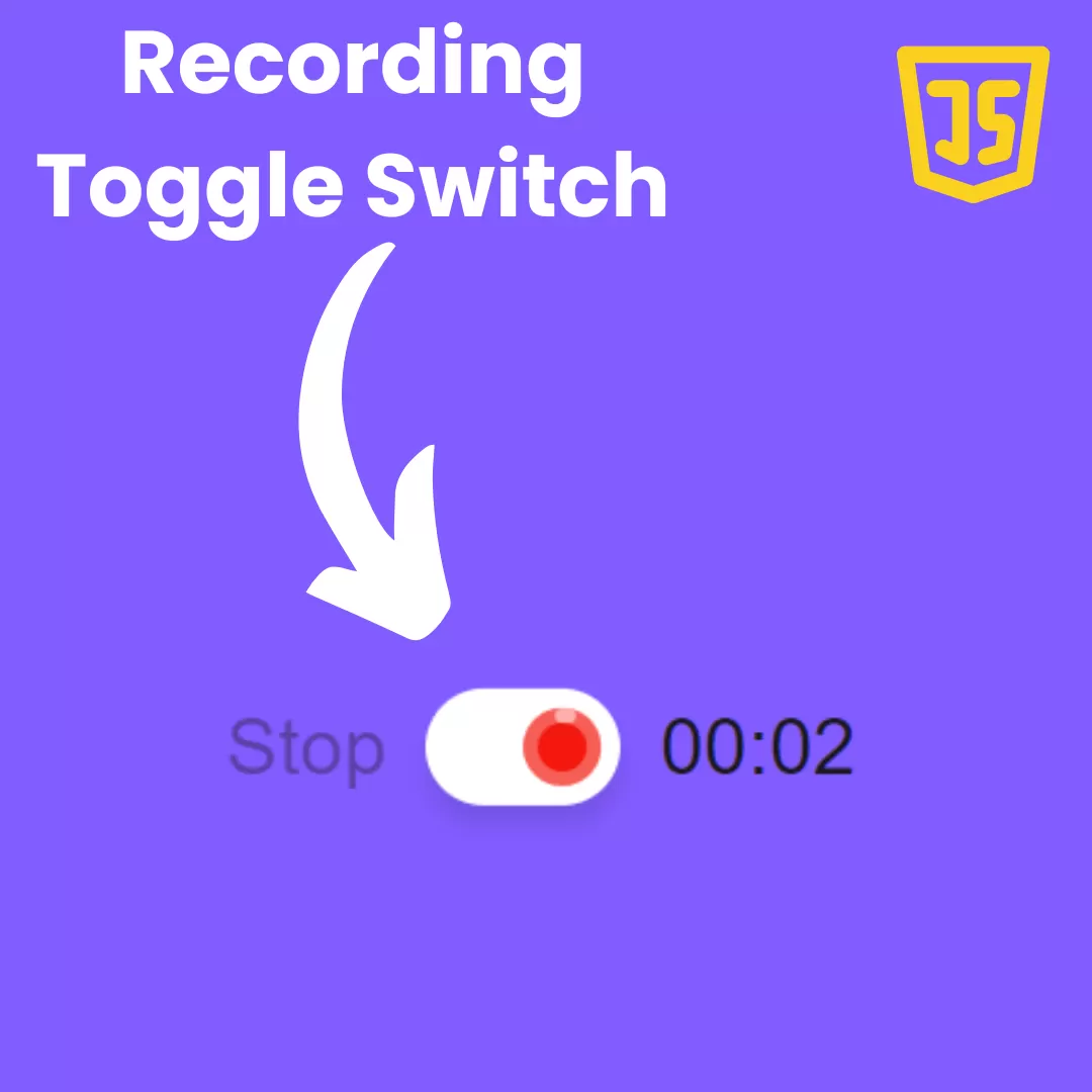
Switches are everywhere. Whether the coffee machine is on or the light is on, humans use toggle switches on a daily basis. Digital toggle switches give the site a more modern feel. They allow designers to include micro-interactions. Another advantage of toggle switches is that they work instantly. Radio buttons or checkboxes force the user to press the submit button before the selection takes effect. A toggle switch allows the user to choose between two opposing states, such as on or off. This tutorial will show you how to create a pure CSS toggle switch button using HTML and CSS with no JavaScript required.
Let's start making an amazing switch button Using HTML and Pure CSS step by step.
Prerequisites:
Before starting this tutorial, you should have a basic understanding of HTML, and CSS. Additionally, you will need a code editor such as Visual Studio Code or Sublime Text to write and save your code.
Source Code
Step 1 (HTML Code):
To get started, we will first need to create a basic HTML file. In this file, we will include the main structure for our toggle switch button.
The checkbox toggle is created using the HTML <input> element, with the type attribute set to checkbox. The ID attribute is set to toggle, and the name attribute is set to toggle. The value attribute is set to is_on, which means that the checkbox will have the value is_on if it is checked.
The checkbox is associated with a label using the for attribute, which matches the id attribute of the checkbox. The label has a class of toy-toggle.
Inside the label, there are several <div> elements. These are used to create the appearance of the toggle switch. The border1, border2, and border3 divs are used to create the border of the toggle switch. The handle div is the part that moves when the toggle is switched on or off. The handle div contains two child divs, handle-off and handle-on, which represent the appearance of the handle in the off and on positions.
When the user clicks on the label, the associated checkbox will be toggled on or off. This code can be used to implement a toggle switch on a webpage, which can be used for a variety of purposes such as turning on/off a feature or changing the theme of the webpage.
After creating the files just paste the below codes into your file. Make sure to save your HTML document with a .html extension, so that it can be properly viewed in a web browser.
This is the basic structure of our toggle switch button using HTML, and now we can move on to styling it using CSS.
Step 2 (CSS Code):
Once the basic HTML structure of the toggle switch button is in place, the next step is to add styling to the toggle switch button using CSS.
Next, we will create our CSS file. In this file, we will use some basic CSS rules to create our toggle switch button.
The switch consists of a circular handle that slides back and forth on a linear track. When the switch is on, the handle is positioned on the right side of the track, and the background of the switch changes color. When the switch is off, the handle is positioned on the left side of the track.
The first block of code sets default styles for all elements, including the box-sizing property, which sets the box model to use border-box sizing (meaning padding and border are included in the element's total width and height). The background of the body is set to a linear gradient, and the display property is set to flex. Custom properties are also defined for the colors of the switch.
The second block of code styles the toggle switch itself. The class .toy-toggle is applied to the outer container of the switch, and several background gradients and box shadows are used to create the appearance of the switch. The class ".border1" and ".border2" are applied to elements that are used to create the border of the switch.
The class ".border3" is applied to an element that is used to create the background of the switch. This class has a transition property that is used to animate the background color when the switch is turned on or off. The class ".handle" is applied to the circular handle that slides back and forth on the track. This element also has a transition property that is used to animate the movement of the handle when the switch is turned on or off.
The last block of code applies styles to the toggle switch when it is turned on or off. The input element that controls the toggle switch is styled to be hidden off-screen. When the input is checked (meaning the switch is turned on), several classes are applied to elements within the switch to animate its appearance. The background color of the switch changes, the handle moves to the right, and the handle-on and handle-off classes are used to animate the opening and closing of the circular handle. When the input is unchecked (meaning the switch is turned off), these classes are removed, and the switch returns to its default appearance.
This will give our button an upgraded presentation. Create a CSS file with the name of styles.css and paste the given codes into your CSS file. Remember that you must create a file with the .css extension.
*, *:before, *:after {
  border: 0;
  box-sizing: border-box;
  margin: 0;
  padding: 0;
}
body {
 background: linear-gradient(rgb(121, 50, 50),rgb(124, 103, 103));
 display: flex;
 height: 100vh;
 --on: #88e661;
 --off: #f0f0f0;
 --transDur: 0.6s;
}
input {
  position: fixed;
  transform: translateX(-100%);
}
.toy-toggle {
 background:
     radial-gradient(at top left,#fff 10%,#fff0 20%),
  radial-gradient(at top right,#fff 20%,#e4e4e4 35%);
border-radius: 6em;
box-shadow:
  0 0 0.25em #0002,
  0 3em 1.5em 0.5em #0002;
cursor: pointer;
display: block;
font-size: 12px;
position: relative;
margin: auto;
width: 20em;
height: 12em;
}
.toy-toggle div {
position: absolute;
}
.toy-toggle > div {
top: 50%;
left: 50%;
}
.toy-toggle > div:not(.handle) {
transform: translate(-50%,-50%);
}
.border1 {
background: #f0f0f0;
border-radius: 5.5em;
box-shadow: 0 0 0.2em 0.1em #f0f0f0;
width: 19em;
height: 11em;
}
.border2 {
background: linear-gradient(0deg,#fff 33%,#ccc 45%);
border-radius: 4.75em;
box-shadow: 0 0 0.2em 0.3em #f0f0f0 inset;
width: 16.5em;
height: 9.5em;
}
.border3, .handle {
background: linear-gradient(90deg, var(--on) 50%, var(--off) 0);
}
.border3 {
background-position: 75% 0;
background-size: 200% 100%;
border-radius: 4.25em;
box-shadow:
  0 0 0.1em 0.1em #ddd inset,
  0 1.5em 1.5em 1em #0004 inset,
  0 0 0 4.25em #0002 inset;
width: 15.5em;
height: 8.5em;
transition: background-position var(--transDur) ease-in-out;
}
.handle {
border-radius: 50%;
box-shadow: 0 0 0.5em 0 #0007;
width: 8.5em;
height: 8.5em;
transform: translate(-90%,-50%);
transition: transform var(--transDur) ease-in-out;
z-index: 0;
}
.handle:before {
background:
  radial-gradient(2em 1.5em at 50% 35%,#fff6 15%,#fff0),
  radial-gradient(1.5em 2.5em at 75% 40%,#fff6 15%,#fff0),
  radial-gradient(100% 100% at 50% 33%,#0000 25%,#0003 50%);
border-radius: 50%;
box-shadow: 0 0 0.3em 0.1em #0003 inset;
content: "";
display: block;
position: absolute;
top: 0;
left: 0;
width: 100%;
height: 100%;
z-index: 3;
}
.handle-off, .handle-on {
width: 50%;
height: 100%;
transition: transform calc(var(--transDur)/2);
z-index: 2;
}
.handle-off {
background: var(--off);
border-radius: 100% 0 0 100% / 50% 50% 50% 50%;
right: 50%;
transform-origin: 100% 50%;
transition-delay: calc(var(--transDur)/2);
transition-timing-function: ease-out;
}
.handle-on {
background: var(--on);
border-radius: 0 100% 100% 0 / 50% 50% 50% 50%;
left: 50%;
transform: scaleX(0);
transform-origin: 0 50%;
transition-timing-function: ease-in;
}

/* On */
input:checked + .toy-toggle .border3 {
background-position: 25% 0;
}
input:checked + .toy-toggle .handle {
transform: translate(-10%,-50%);
}
input:checked + .toy-toggle .handle-off {
transform: scaleX(0);
transition-delay: 0s;
transition-timing-function: ease-in;
}
input:checked + .toy-toggle .handle-on {
transform: scaleX(1);
transition-delay: calc(var(--transDur)/2);
transition-timing-function: ease-out;
}
Final Output:

Conclusion:
Creating a pure CSS toggle switch button using HTML and CSS is easier than you might think. With just a few lines of code, you can create a stylish and functional toggle switch for your website. Be sure to experiment with different colors, shapes, and sizes to find the perfect toggle switch for your website.
That’s a wrap!
I hope you enjoyed this post. Now, with these examples, you can create your own amazing page.
Did you like it? Let me know in the comments below 🔥 and you can support me by buying me a coffee
And don’t forget to sign up to our email newsletter so you can get useful content like this sent right to your inbox!
Thanks!
Faraz 😊


